LUXURY HOME EQUIPMENT

SANITARYWARE

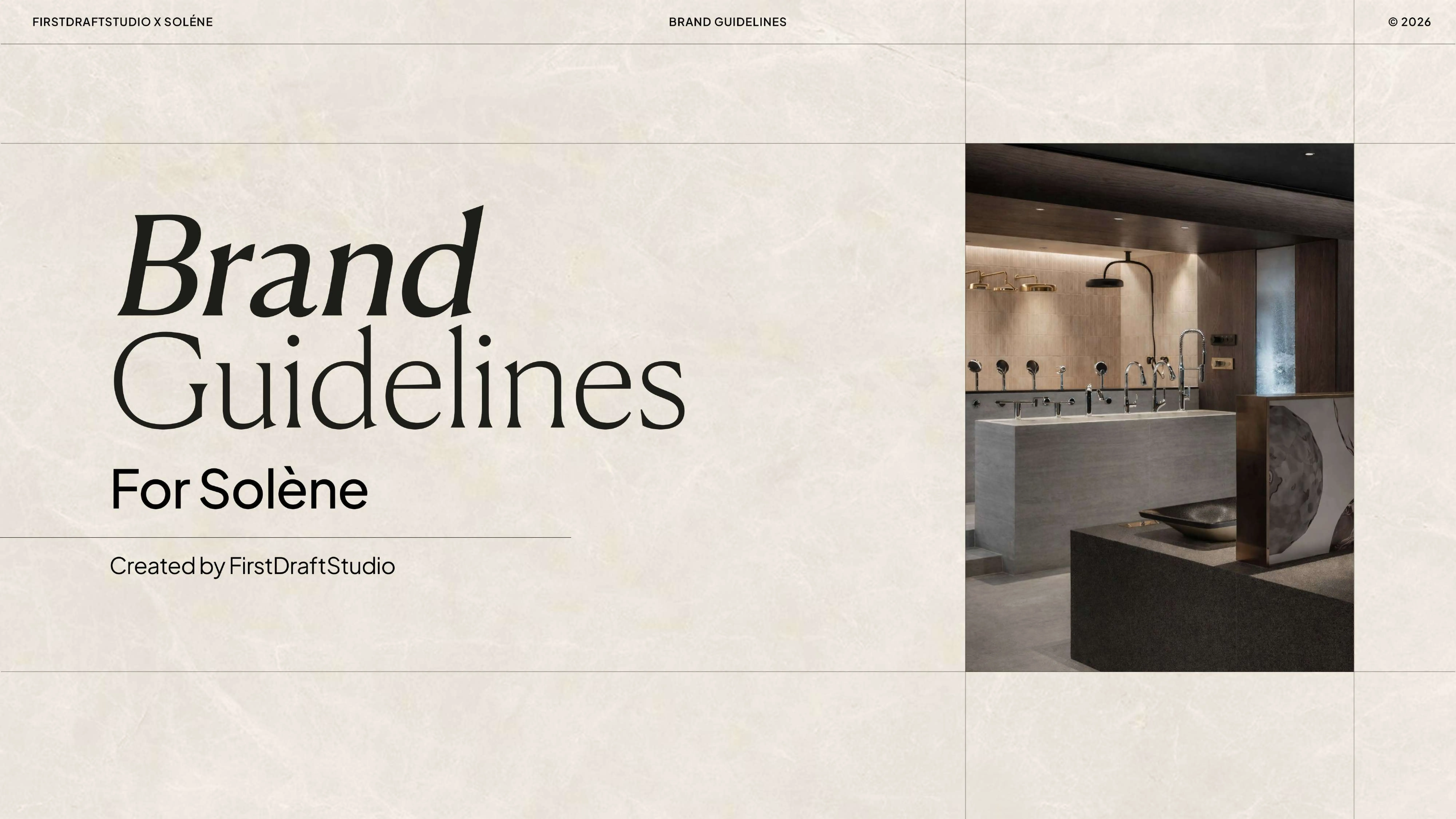
INTERIOR FULL BRAND BOOK

Solène was entering a category owned by century-old names. It needed an identity strong enough to stand apart from day one.

A luxury home equipment brand needed more than a premium look to differentiate from established players. Here's the full brand book, visual code, and identity system we built.
CATEGORY

Luxury home equipment and sanitaryware, a category shaped by century-old European names and near-identical luxury cues.

CATEGORY

Luxury home equipment and sanitaryware, a category shaped by century-old European names and near-identical luxury cues.

CHALLENGE

The brief was explicit: real differentiation from established competitors, not simply a more premium finish.

CHALLENGE

The brief was explicit: real differentiation from established competitors, not simply a more premium finish.

MARKET

A bilingual market, requiring the identity to work at full strength in both English and Arabic, not one translated from the other.

MARKET

A bilingual market, requiring the identity to work at full strength in both English and Arabic, not one translated from the other.

AMBITION

A brand identity built as an original design language, not a set of borrowed luxury conventions.

AMBITION

A brand identity built as an original design language, not a set of borrowed luxury conventions.

Pain Point

Looking premium wasn't the brief. Looking like nobody else in the category was.

Luxury sanitaryware and home equipment is a category owned by brands with decades, sometimes a century, of design heritage. Walking in with generic luxury cues, gold accents, an elegant serif, would have made Solène just another name on an already crowded shelf. The client's core ask was explicit from the start: real differentiation, not just polish. That meant Solène needed an identity built from an original visual language of its own, not borrowed conventions, something specific enough to be unmistakably itself in a market built on sameness.

“In a category built on sameness, looking premium isn't enough. Solène needed to look like nobody else.”

Services deployed
BRAND STRATEGY & POSITIONING
MONOGRAM & VISUAL CODE
CUSTOM TYPOGRAPHY DESIGN
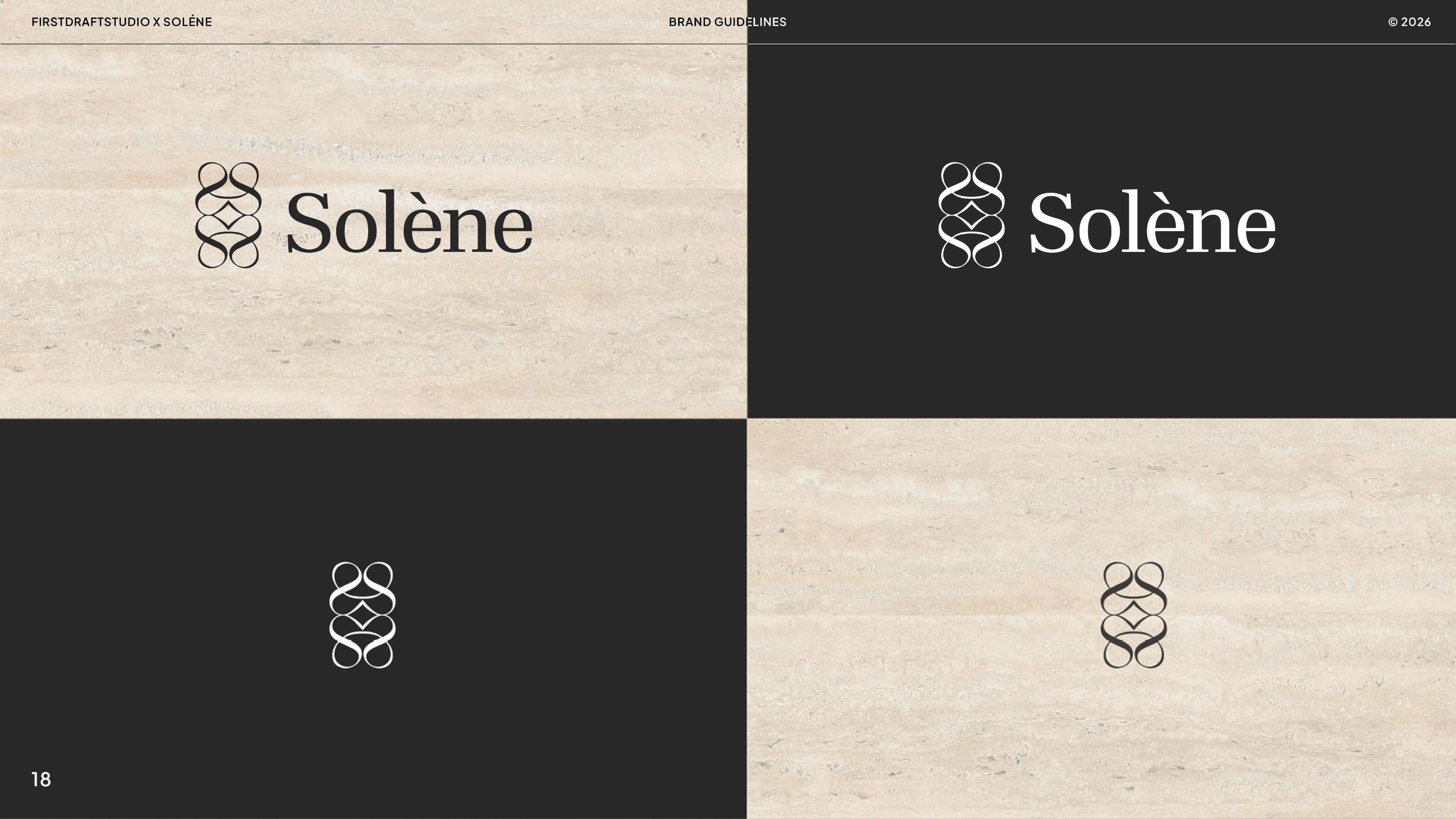
BILINGUAL LOGO DESIGN (EN/AR)
SIGNAGE & COLLATERAL DESIGN
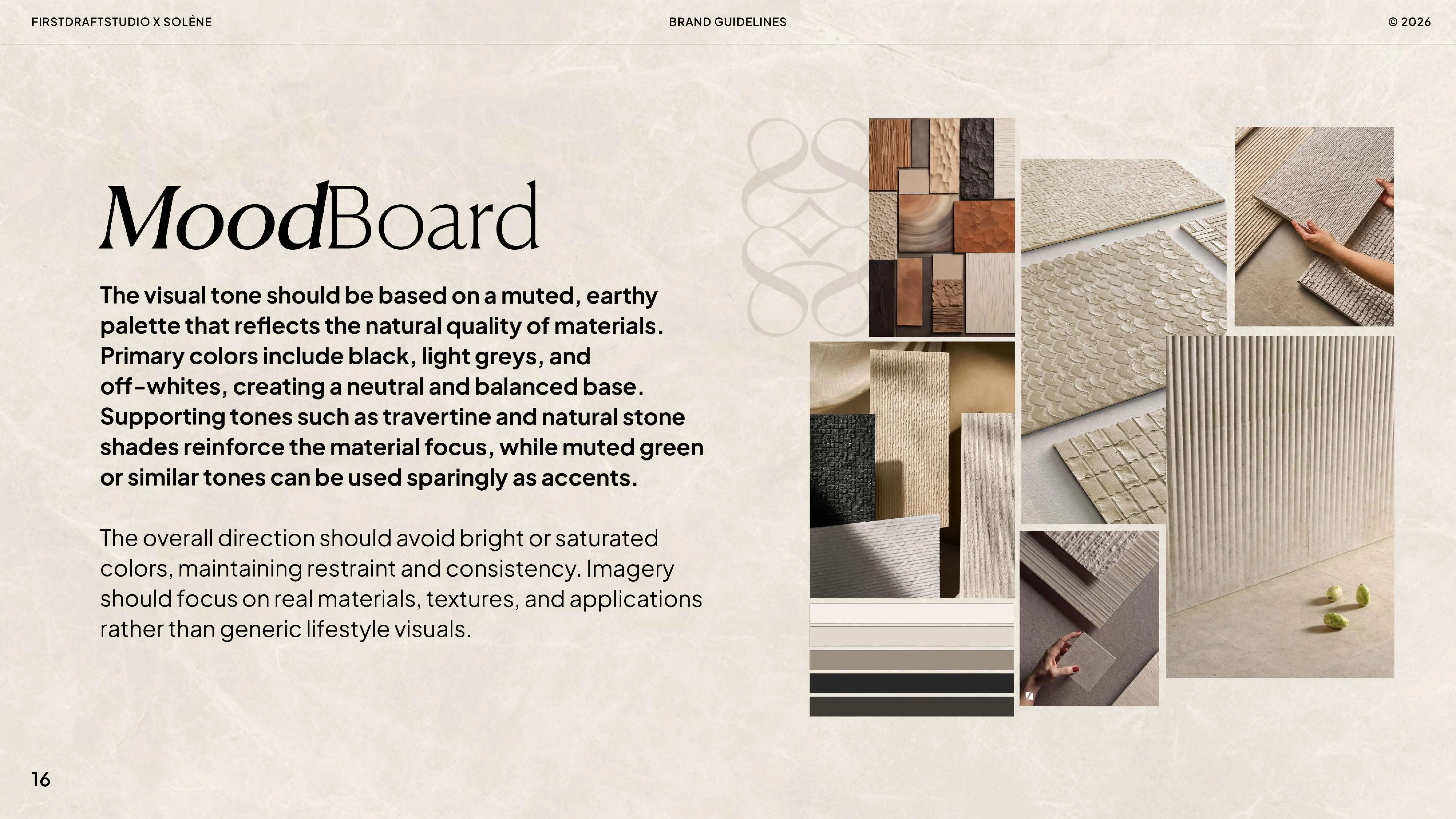
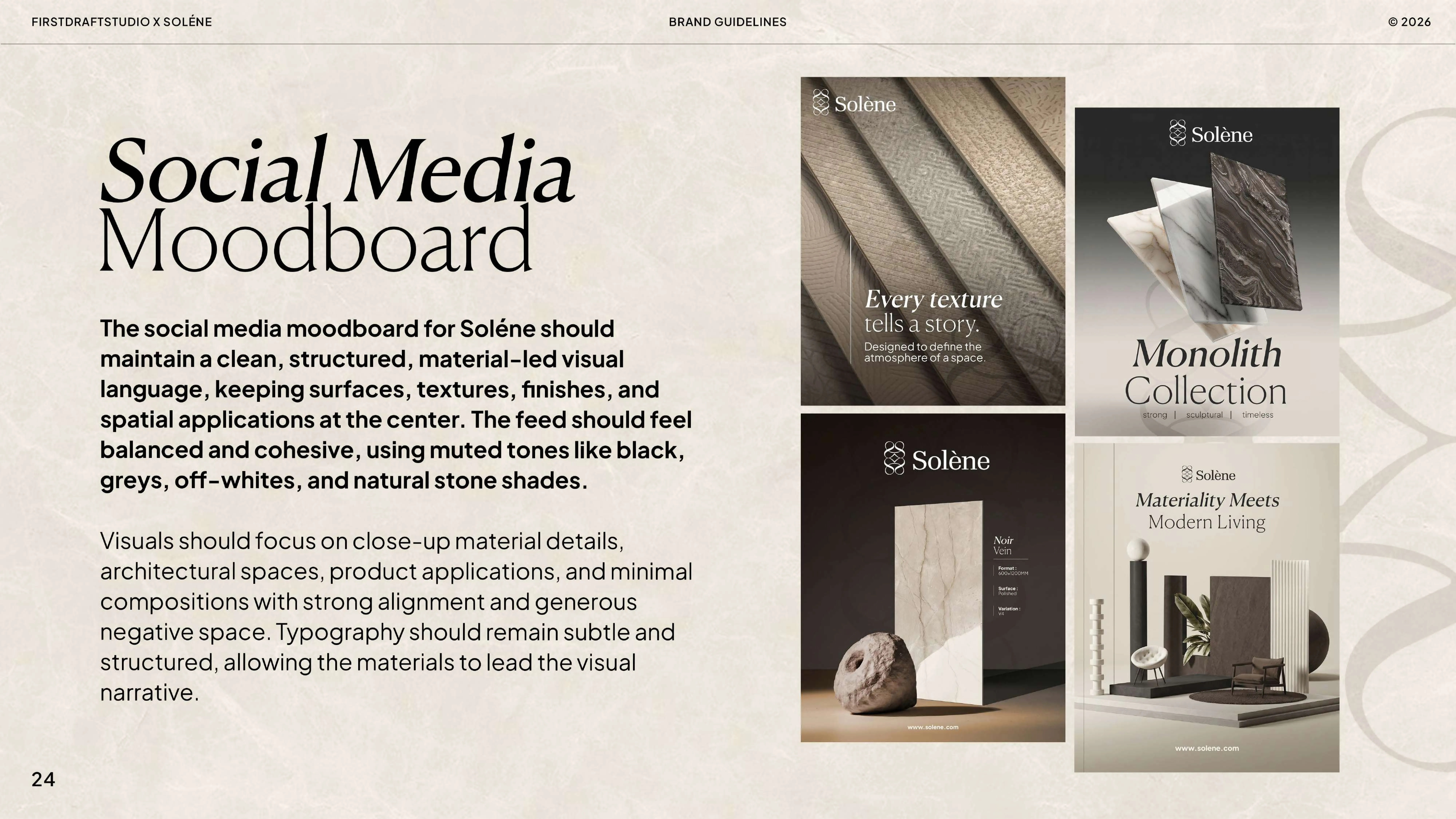
MOOD BOARD DEVELOPMENT
UGC & INFLUENCER MARKETING

Execution

The team behind it

Brand strategists and identity designers built the full brand system together, from the visual code through to real-world application.

The team behind it

Brand strategists and identity designers built the full brand system together, from the visual code through to real-world application.

We established the monogram system as the soul of the identity, deciding exactly how it would be used across every touchpoint before any other design work began.

We built stone-cut geometry as Solène’s signature visual language, giving the brand a design core that belonged to no one else in the category.

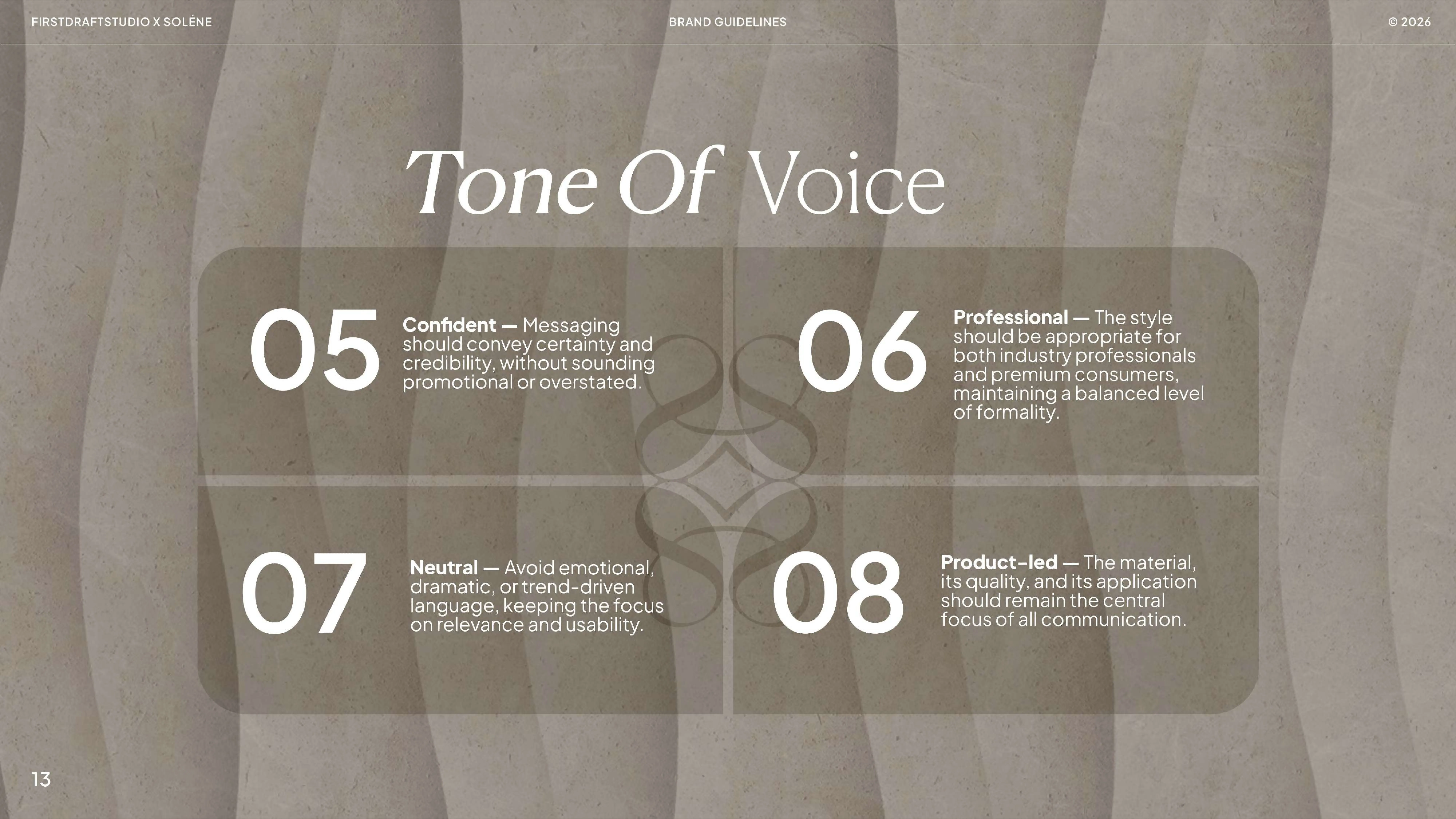
Brand message, tagline, positioning, target audience, tone of voice, dos and don’ts, and a custom typography system were all built out to create a distinctive and consistent identity.

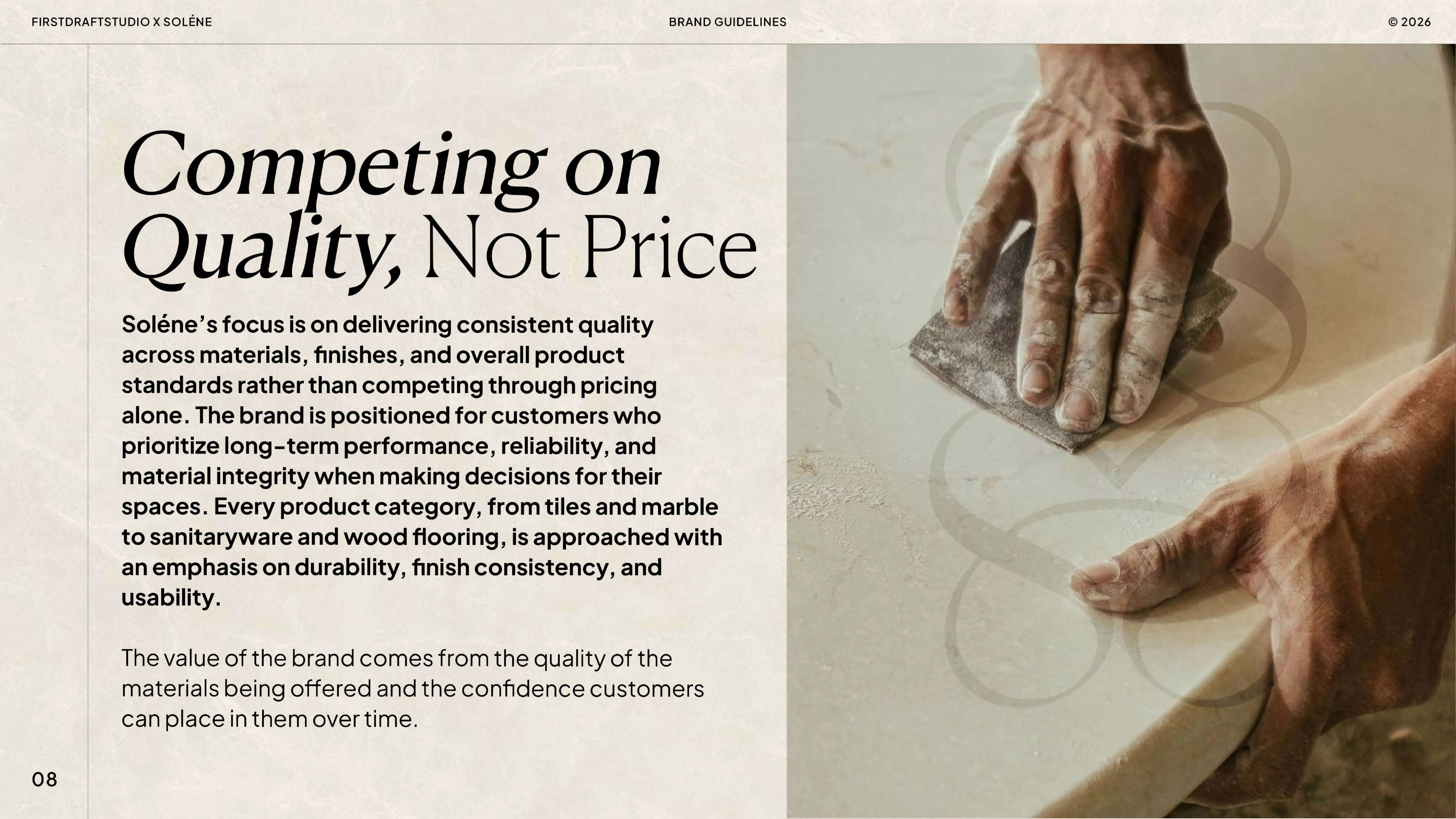
The logo was built in English and Arabic, then applied across signboards (five options), visiting cards, letterheads, and both social and brand mood boards.
01

Defined the brand visual code: the monogram system as the soul of the identity.

Every identity needs a core it always returns to. We built the monogram system first, establishing exactly how it would carry across the entire brand before any other visual decision was made.

03

Built a custom typography system unique to the brand.

Typography this specific isn't licensed, it's designed. We developed a custom way of writing typography that functions as core identity, not just a font choice.

02

Developed stone-cut geometry as Solène's visual core.

A generic luxury look wasn't the brief. We built stone-cut geometry as an original design language, giving Solène a visual signature no competitor could claim.

What we did

05

Defined the brand visual code: the monogram system as the soul of the identity.

A bilingual brand needs two logos built with equal care, not one translated. We designed the logo in English and Arabic, then applied it across five signboard options, visiting cards, letterheads, and mood boards to prove it held up everywhere.

04

Built the full strategic layer: message, positioning, differentiation, voice, and rules.

The client's real ask was differentiation, so strategy had to lead. We built out brand message, tagline, positioning built around standing apart from competitors, target audience, tone of voice, and documented dos and don'ts.

Before & After

Before

After

Visual code

No defined monogram or visual system

A monogram system used as the soul of the brand

A monogram system used as the soul of the brand

Design language

No original visual core

Stone-cut geometry as a signature visual language

Stone-cut geometry as a signature visual language

Typography

Undefined, likely to default to a licensed font

A custom typography system built specifically for Solène

A custom typography system built specifically for Solène

Differentiation

At risk of blending into a crowded luxury category

A brand built explicitly to stand apart from established players

A brand built explicitly to stand apart from established players

Logo

None

A full logo system in English and Arabic

A full logo system in English and Arabic

Real-world application

Undefined

Signboards, visiting cards, letterheads, and mood boards, all built

Signboards, visiting cards, letterheads, and mood boards, all built

Luxury alone was never going to be the differentiator. An original visual language was.

Luxury alone was never going to be the differentiator. An original visual language was.

Luxury alone was never going to be the differentiator. An original visual language was.

Results

1

Monogram & Visual Code System

2

Logo Languages (EN + AR)

5

Signboard Options Delivered

1

Complete Brand Book

1

Monogram & Visual Code System

2

Logo Languages (EN + AR)

5

Signboard Options Delivered

1

Complete Brand Book

Beyond the numbers

An original visual language, monogram and stone-cut geometry, that no competitor in the category can claim

A bilingual identity that works at full strength in both English and Arabic, not a translated afterthought

A brand system proven across real-world applications, signage, collateral, social, not just a deck that stays in a folder

Image
Image
Image

This wasn't a logo project. It was building the original visual language a luxury brand needed to avoid disappearing into its own category.

This wasn't a logo project. It was building the original visual language a luxury brand needed to avoid disappearing into its own category.

Takeaways for Brand

Takeaways for Brand

Pin icon image

Premium Isn’t the Differentiator. Originality Is

In a category built on sameness, premium isn’t a differentiator. An original visual language is.

Pin icon image

A Monogram Is a System, Not Just a Mark

It’s a system that has to work as hard as the logo itself.

Pin icon image

Differentiation Starts With Strategy, Not Visuals

Positioning comes before the palette.

Pin icon image

Bilingual Brands Need Equal Logo Consideration

Each language deserves its own consideration.

Pin icon image

A Brand Book Must Survive the Real World

A business card, and a real shopfront, not just a PDF.

Pin icon image

Premium Isn’t the Differentiator. Originality Is

In a category built on sameness, premium isn’t a differentiator. An original visual language is.

Pin icon image

Differentiation Starts With Strategy, Not Visuals

Positioning comes before the palette.

Pin icon image

A Brand Book Must Survive the Real World

A business card, and a real shopfront, not just a PDF.

Pin icon image

A Monogram Is a System, Not Just a Mark

It’s a system that has to work as hard as the logo itself.

Pin icon image

Bilingual Brands Need Equal Logo Consideration

Each language deserves its own consideration.

01

Defined the brand visual code: the monogram system as the soul of the identity.

Every identity needs a core it always returns to. We built the monogram system first, establishing exactly how it would carry across the entire brand before any other visual decision was made.

02

Developed stone-cut geometry as Solène's visual core.

A generic luxury look wasn't the brief. We built stone-cut geometry as an original design language, giving Solène a visual signature no competitor could claim.

03

Built a custom typography system unique to the brand.

Typography this specific isn't licensed, it's designed. We developed a custom way of writing typography that functions as core identity, not just a font choice.

04

Built the full strategic layer: message, positioning, differentiation, voice, and rules.

The client's real ask was differentiation, so strategy had to lead. We built out brand message, tagline, positioning built around standing apart from competitors, target audience, tone of voice, and documented dos and don'ts.

05

Defined the brand visual code: the monogram system as the soul of the identity.

A bilingual brand needs two logos built with equal care, not one translated. We designed the logo in English and Arabic, then applied it across five signboard options, visiting cards, letterheads, and mood boards to prove it held up everywhere.

What we did
Portfolio image
Portfolio image

Ready to look like you're already winning?

Ready to look like you're already winning?

Tell us about your project whether it’s a Website, Branding, or Social Media.

Tell us about your project whether it’s a Website, Branding, or Social Media.

Dubai × Bengaluru

Limited Client Partnerships

Dubai × Bengaluru

Limited Client Partnerships

Available for work

Avatar
Avatar
Avatar
Avatar
Avatar
Avatar

Our team

#Creative Squad