GLOBAL
PREMIUM ENGINEERED WATCHES D2C
WATCH BRAND IDENTITY & GUIDELINE
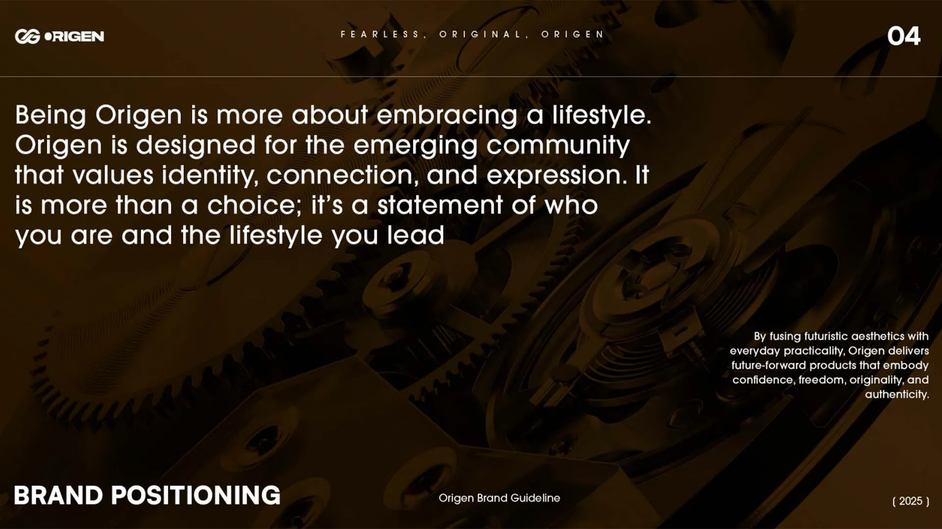
Origen had watches worth building a brand around. It didn't have the brand yet.
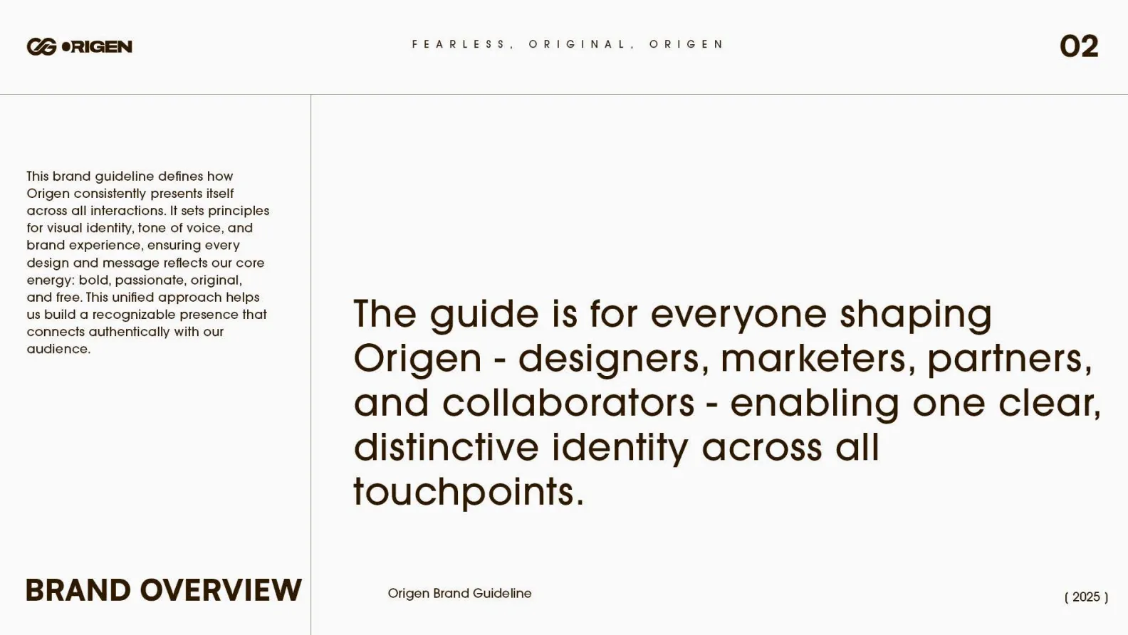
A premium engineered watch brand needed a complete identity system, positioning, voice, visual language, and packaging, built to match the precision of the product itself. Here's the brand we built.




Pain Point
Origen had a genuinely considered product. It didn't have a brand system built to carry that same level of intent.
A watch brand built on surgical-grade steel, sapphire-coated glass, and Swiss movements is making a real claim to quality, but a claim like that needs an identity precise enough to back it up. Origen didn't have a defined visual language, a settled logo, or a documented voice, which meant every piece of content risked looking like a different brand made it. The brand's target audience, Gen Z first movers who reject trend-driven design, would recognize inconsistency immediately; this is an audience that values originality specifically, so an unoriginal or inconsistent brand system would undercut the product's entire premise. The challenge wasn't the product's quality. It was translating that quality into a logo, a colour and type system, a documented voice, and packaging considered enough that everything Origen touched felt like the same disciplined, engineered brand.
“A brand built on precision and material discipline can't have an identity that looks improvised. Every touchpoint has to prove the same standard the product claims.”
Services deployed
Execution





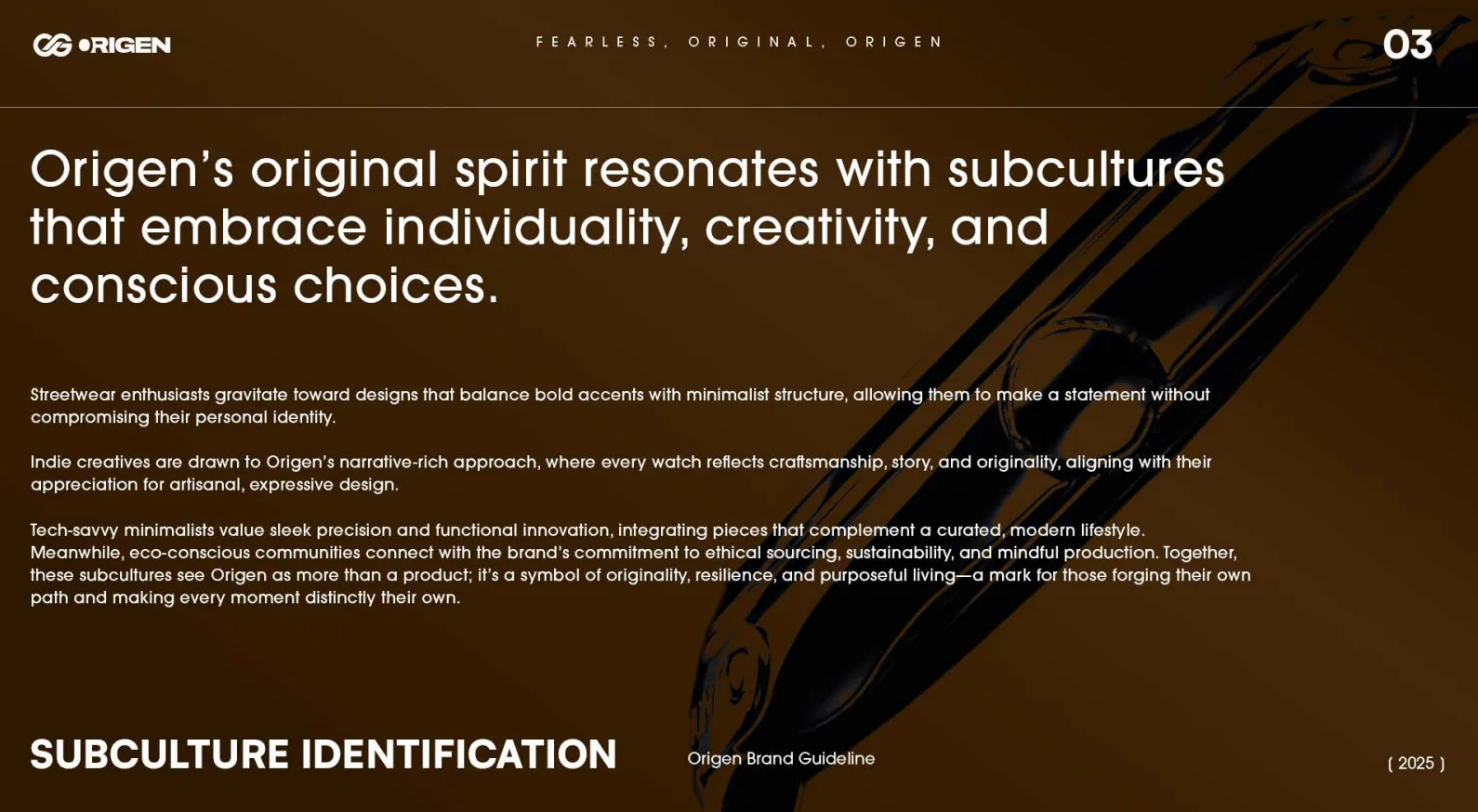
Primary (Gen Z first movers), secondary (young professionals), and aspirational audiences were mapped in detail, so every design decision that followed had a specific person in mind.
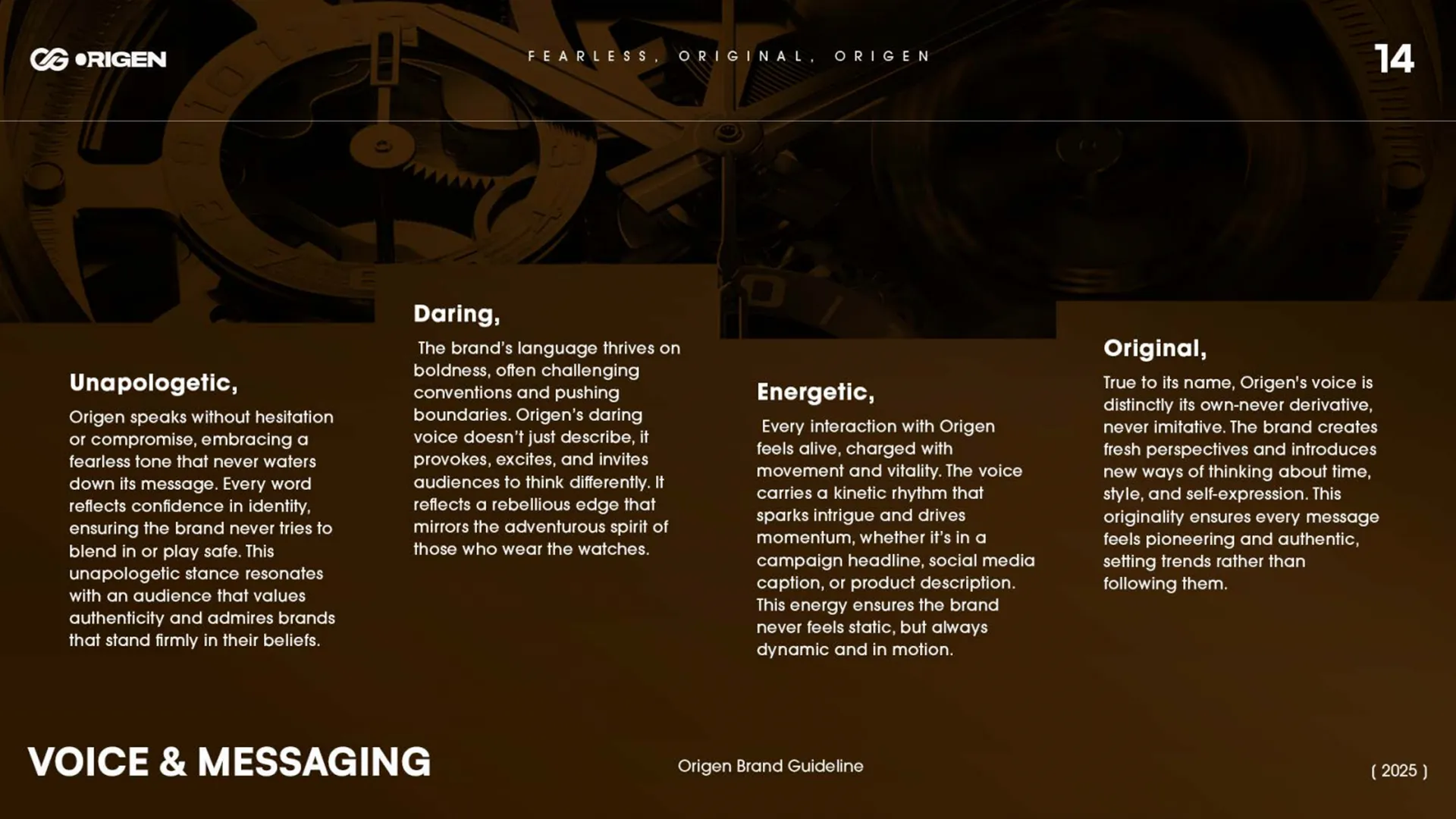
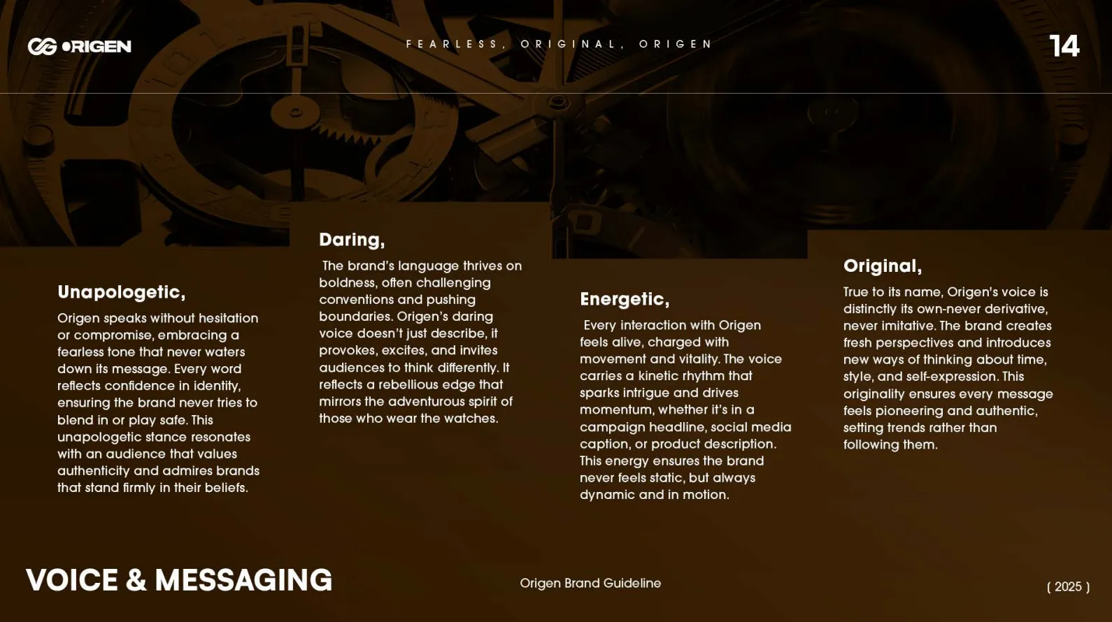
Confidence, Freedom, Passion, Individuality, Originality, and Bold Innovation were built into explicit Do's and Don'ts, so tone stayed consistent across every future piece of content.
The OG monogram was designed to work across every context, watch faces, packaging, and digital touchpoints, without needing to be reinvented per platform.
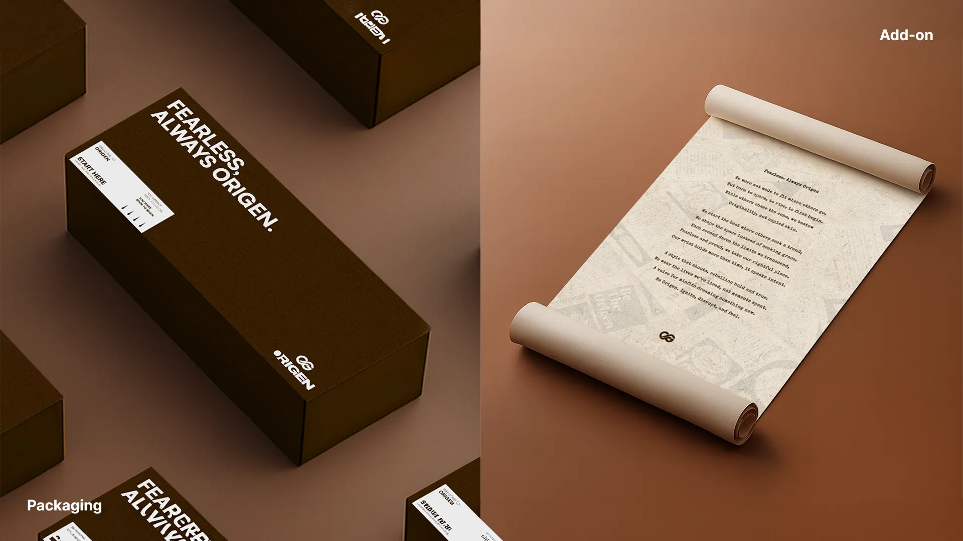
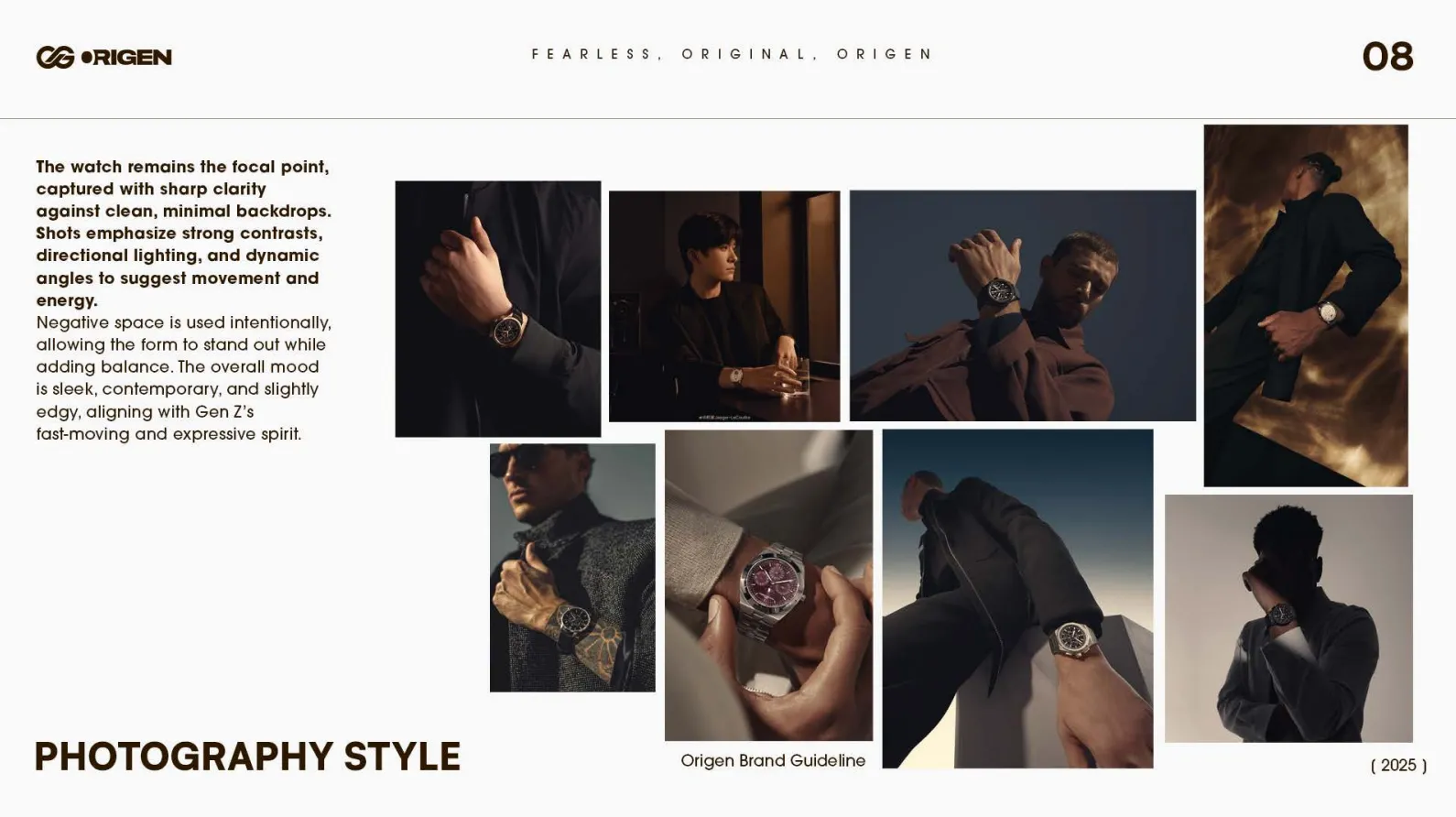
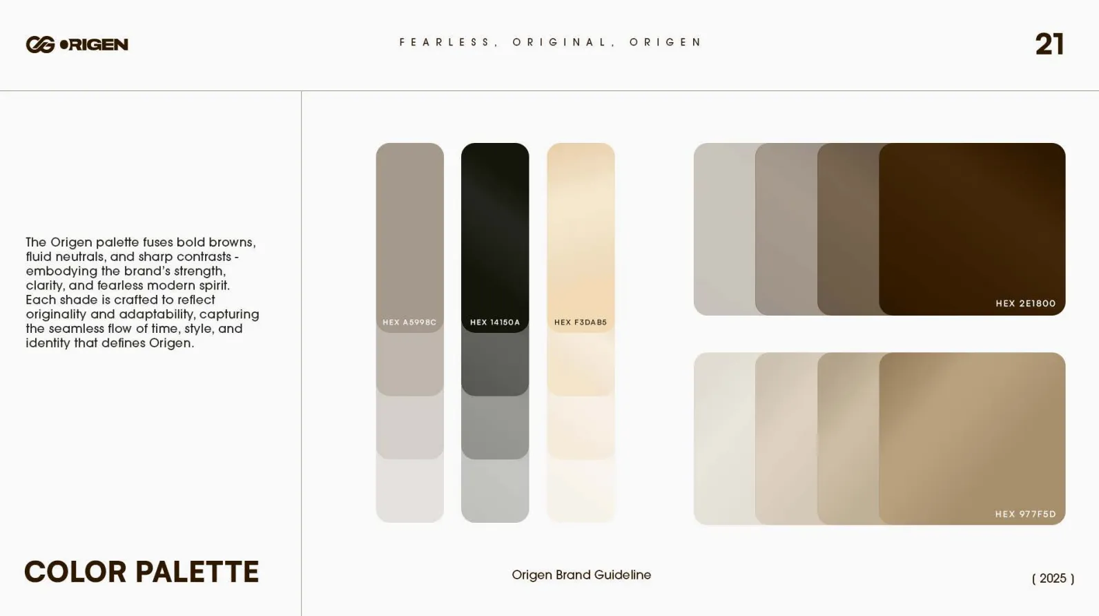
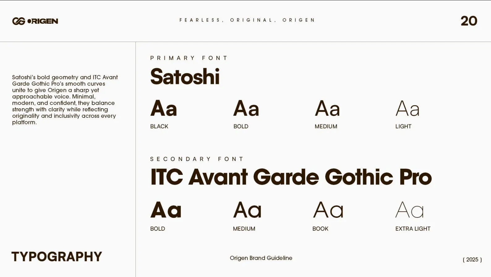
Primary and secondary fonts, a bold-brown and neutral colour palette, and a defined photography approach were locked into one reference guide, alongside premium packaging design.

Before & After
Before
After
No documented positioning, voice, or visual system
Undefined mark
General sense of target customer
Tone dependent on whoever was writing
No locked typography, colour, or photography direction
Undefined