GLOBAL

PREMIUM ENGINEERED WATCHES D2C

IMMERSIVE WEBSITE & AI IMAGERY BUILD

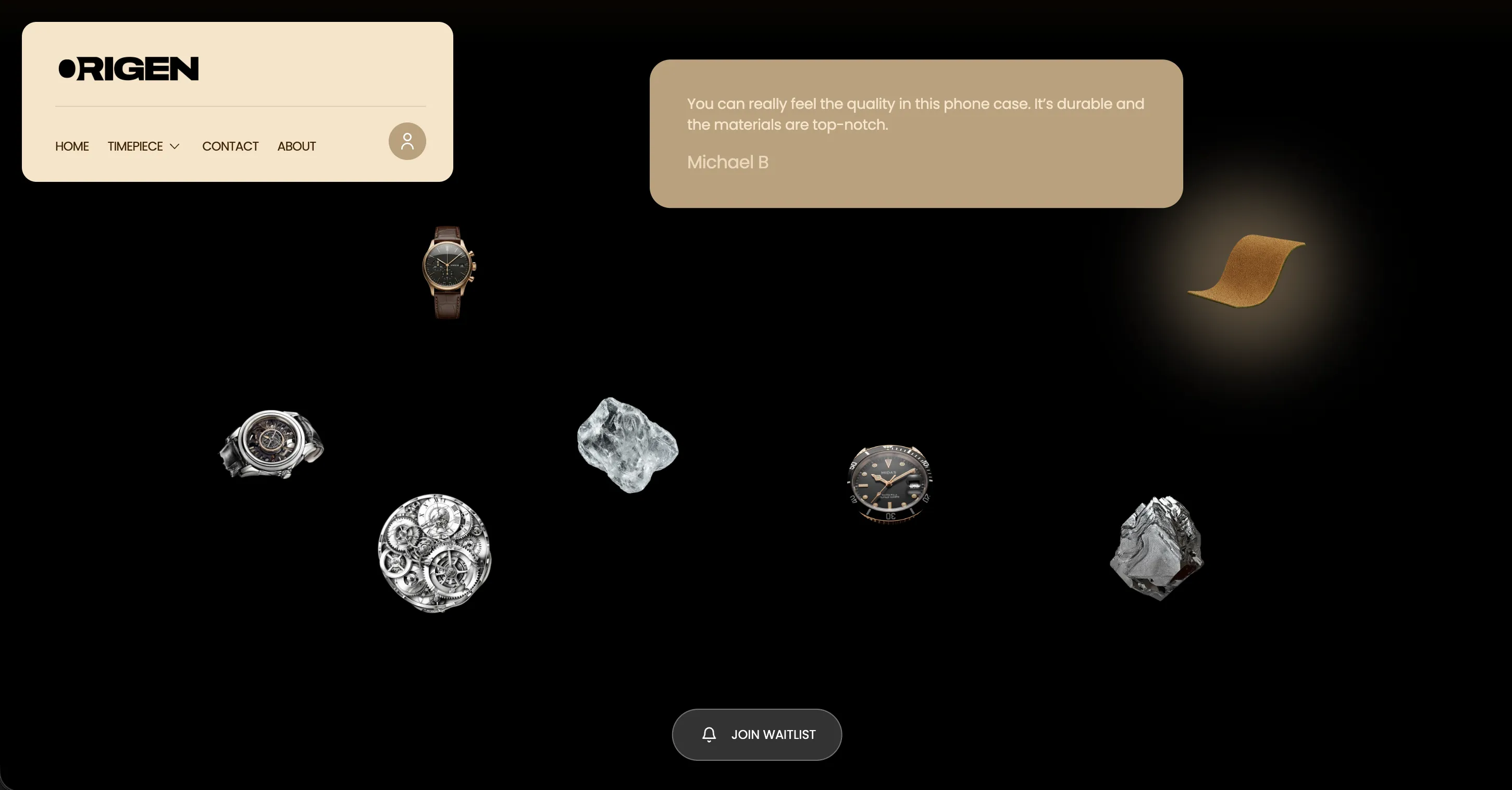
Origen launched with three watches. The site should have been a visual treat to depict the same.

A premium engineered watch brand launching with just three products needed a website immersive enough to carry a small catalogue, and a waitlist built to make exclusivity feel intentional, not incomplete. Here's what we built.
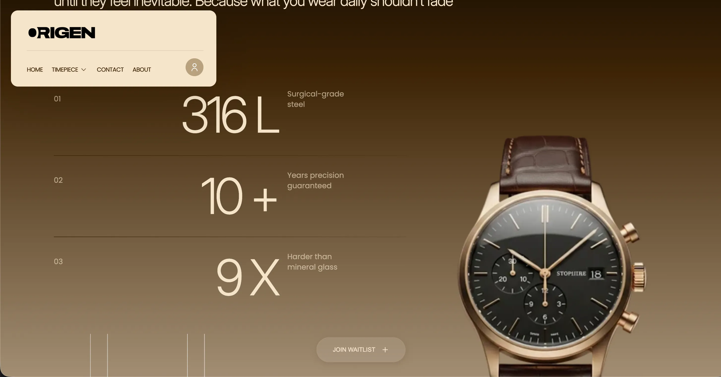
ORIGIN

Born from a refusal to settle for trend-driven design and cheap materials marketed as premium, Origen builds watches for ‘creators, rule breakers, first movers.’

ORIGIN

Born from a refusal to settle for trend-driven design and cheap materials marketed as premium, Origen builds watches for ‘creators, rule breakers, first movers.’

MATERIALS

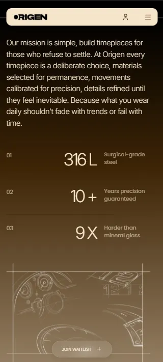
Surgical-grade steel instead of plated alloys, sapphire-coated glass instead of mineral crystal, Swiss movements instead of generic quartz, every decision made for longevity, not cost.

MATERIALS

Surgical-grade steel instead of plated alloys, sapphire-coated glass instead of mineral crystal, Swiss movements instead of generic quartz, every decision made for longevity, not cost.

RANGE

A deliberately small launch catalogue of three watches, each treated as its own considered release rather than one of many SKUs.

RANGE

A deliberately small launch catalogue of three watches, each treated as its own considered release rather than one of many SKUs.

POSITIONING

‘Not fashion, not hype, expression,’ built for people who ask about durability before design.

POSITIONING

‘Not fashion, not hype, expression,’ built for people who ask about durability before design.

Pain Point

Origen launched with three watches. The site couldn't read like it was waiting to have more.

Most new D2C brands launch with a full catalogue and a site built to move volume across it. Origen launched with three watches, a deliberate choice, not a limitation to apologize for. But a small catalogue on a generic ecommerce template reads as thin, like a brand still building out its range, not one making a considered statement. Origen's own materials story, surgical-grade steel, sapphire-coated glass, Swiss movements, needed a site considered enough to match that level of intent, and a small catalogue needed to feel curated, not sparse. On top of that, Origen wanted exclusivity built into the experience itself, a waitlist that made scarcity feel like the brand's choice, not a stock problem. The challenge wasn't the product count. It was building a site immersive enough that three watches felt like exactly the right number.

“Three products isn't a limitation to hide. It's a decision, if the site is confident enough to make it feel like one.”

Services deployed
SHOPIFY WEBSITE DESIGN & BUILD
AI-LED CREATIVE PRODUCTION
SCROLL & MOTION UX DESIGN
DEDICATED PRODUCT PAGE ARCHITECTURE
WAITLIST & EXCLUSIVITY FUNCTIONALITY
ONGOING CREATIVE DIRECTION
UGC & INFLUENCER MARKETING

Execution

The team behind it

Web strategists, Shopify developers, AI creative producers, and front-end/motion designers built the site as one continuous, scroll-driven experience.

The team behind it

Web strategists, Shopify developers, AI creative producers, and front-end/motion designers built the site as one continuous, scroll-driven experience.

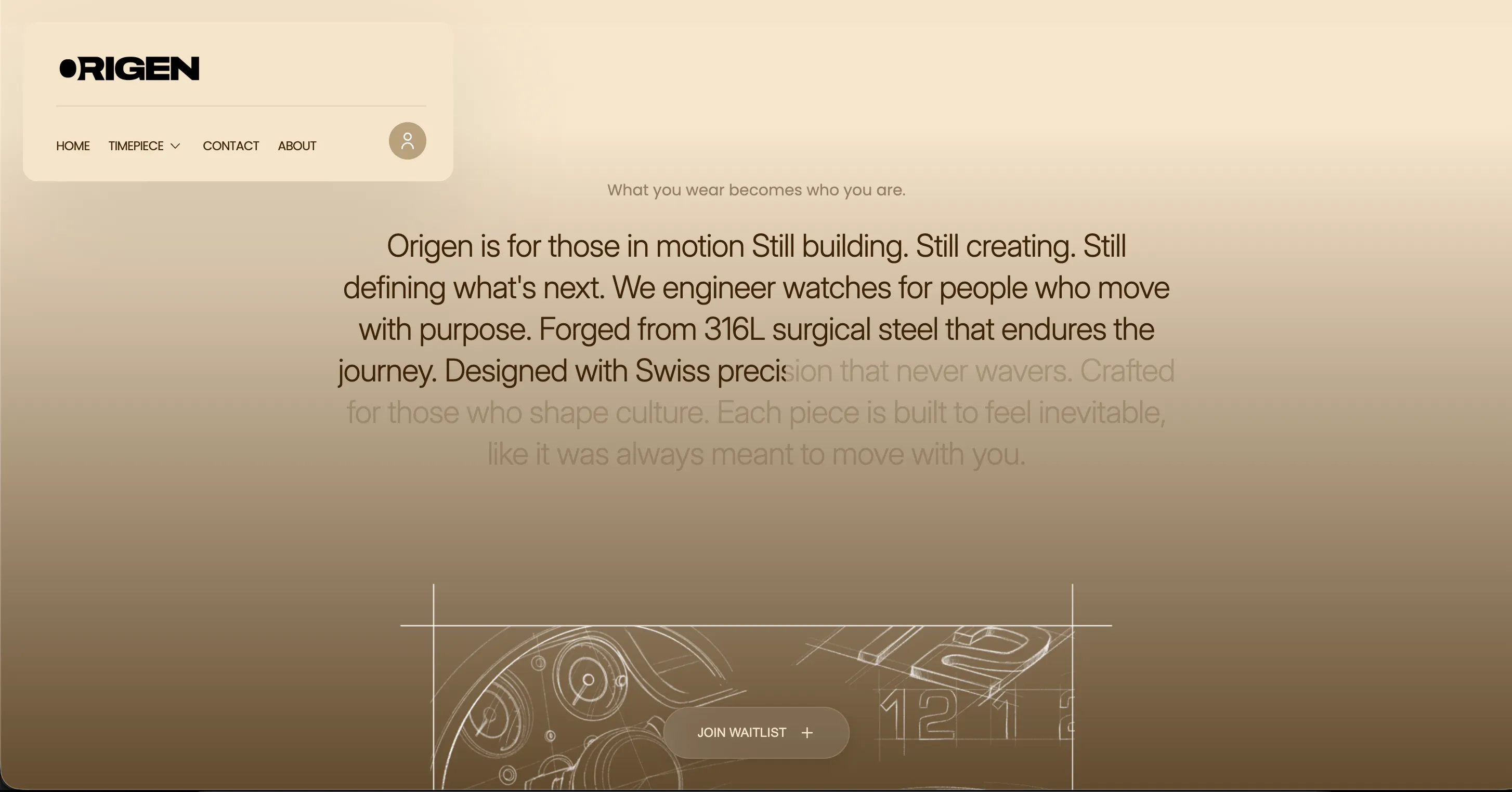
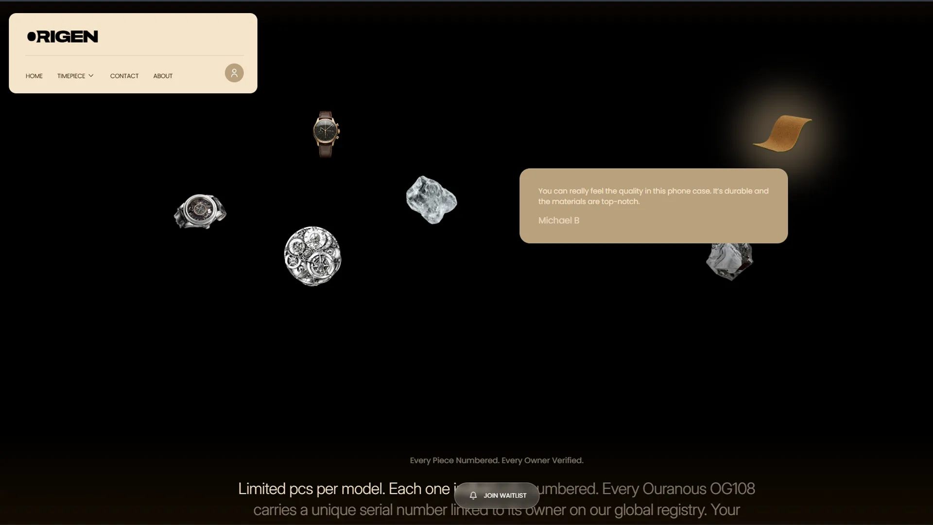
Scroll-triggered appear effects and transitions ran throughout, so moving through the site felt closer to unboxing a product than browsing a catalogue.

Each watch got its own considered page and narrative, treated as an individual release rather than a line item.

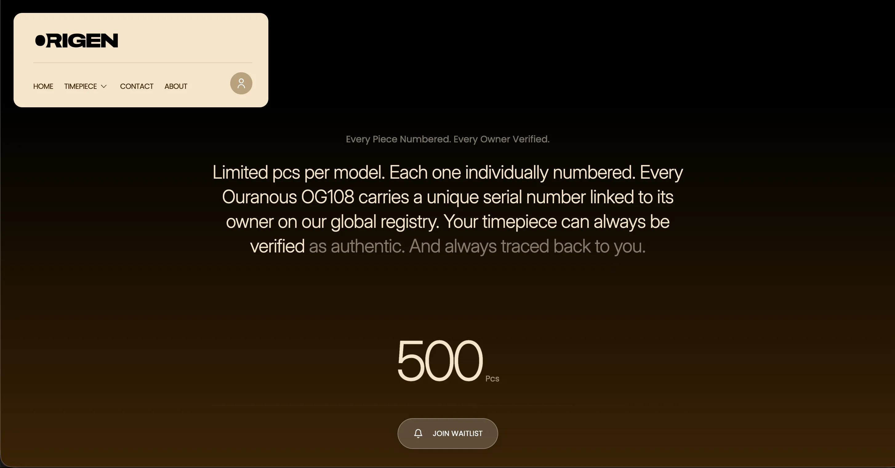
A dedicated "Join the Waitlist" experience turned a small, considered catalogue into a positioning advantage rather than something to explain away.

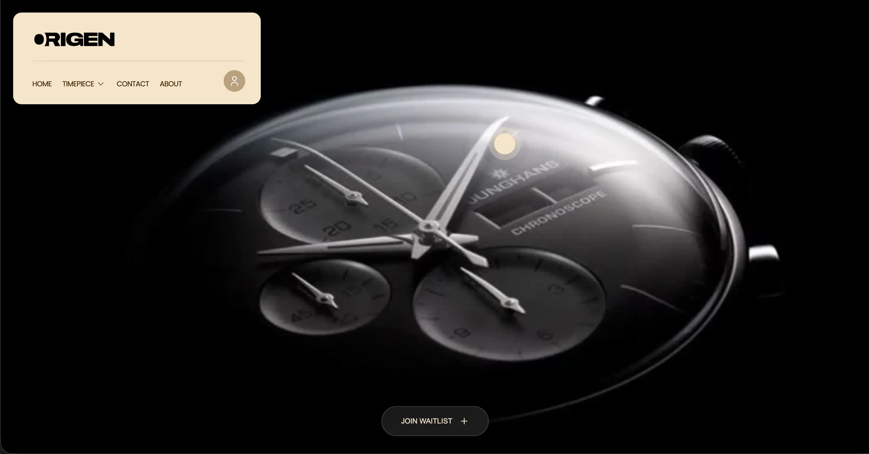
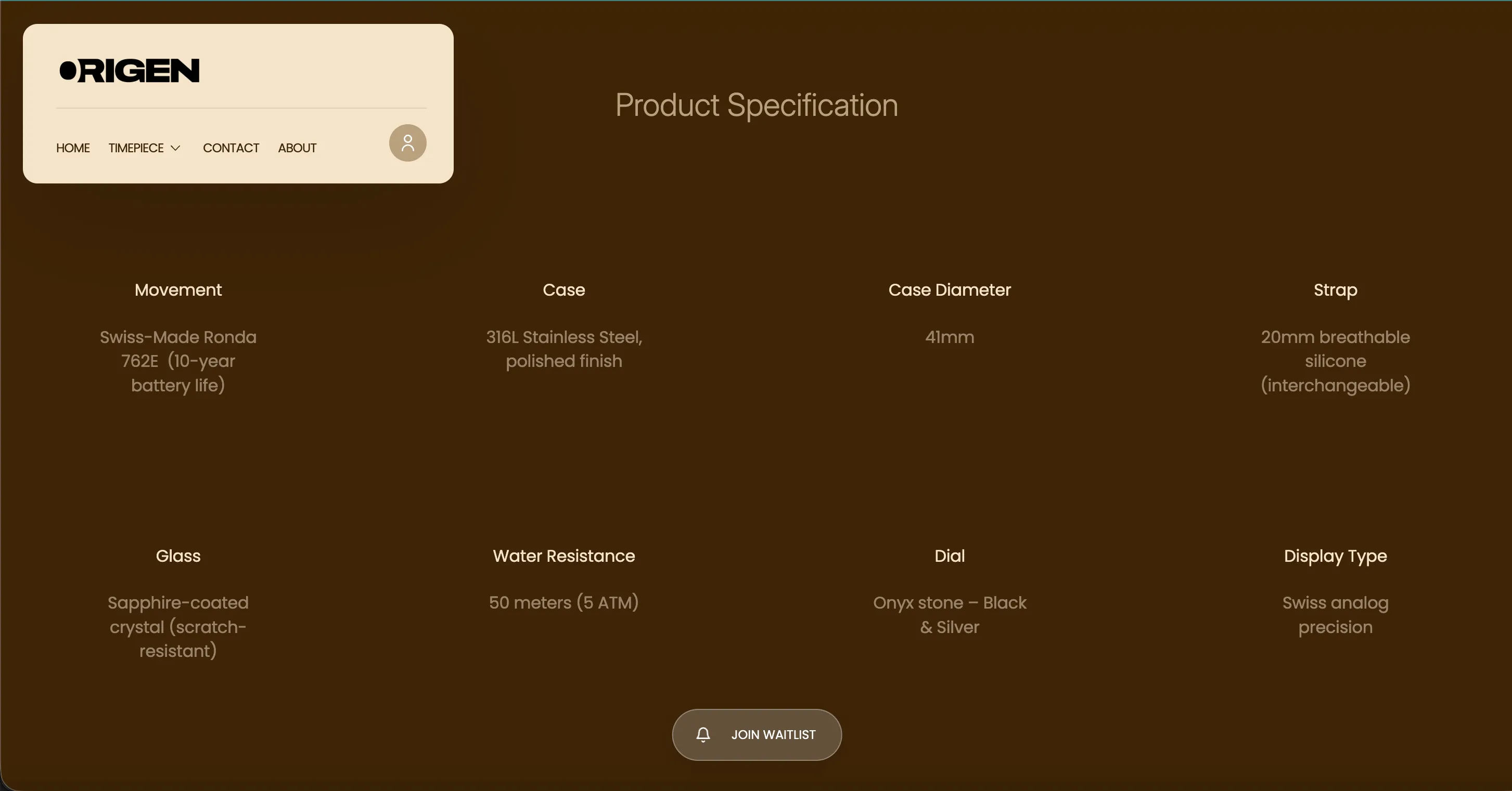
Visuals reflected the same precision as the materials, surgical steel, sapphire glass, while the scroll and motion experience was tested separately for mobile and desktop..
01

Built an immersive, scroll-driven site instead of a static catalogue.

A brand built on precision and intent couldn't launch on a generic template. We built scroll-triggered appear effects and transitions throughout, so moving through the site felt as considered as the watches themselves.

03

Designed a waitlist that turned a small catalogue into a statement.

Exclusivity only works if it feels intentional. We built a dedicated waitlist experience that made ‘only three watches’ read as a considered choice, not a brand still finding its footing.

02

Gave each of the three watches its own dedicated page and story.

Three products on one grid page would have looked thin. We built three distinct, considered pages instead, treating each watch as its own release with its own narrative, not a line item.

What we did

05

Built an immersive, scroll-driven site instead of a static catalogue.

An immersive, effect-heavy site behaves differently on a phone than on a laptop. We built and tested the scroll experience for both, so the site felt considered everywhere it was viewed, not just on the platform it was designed on first.

04

Produced AI-led imagery matched to the brand's material precision.

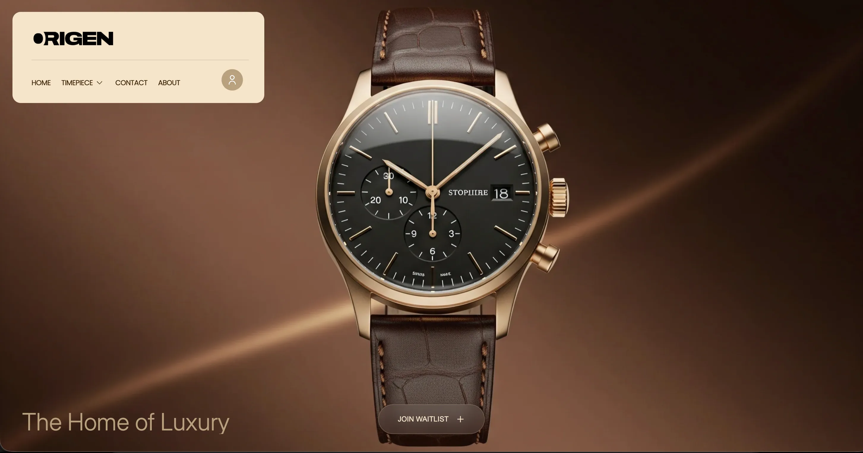
Origen's story is about surgical steel and sapphire glass, not softness. We built AI-generated imagery styled to reflect that same precision, giving the brand a premium visual language without a full studio shoot for a three-product launch.

Before & After

Before

After

Website

No site built yet

An immersive, scroll-driven Shopify store with appear effects throughout

An immersive, scroll-driven Shopify store with appear effects throughout

Product pages

N/A, pre-launch

Three dedicated, individually considered product pages

Three dedicated, individually considered product pages

Catalogue perception

Risk of reading as thin or incomplete

Reads as a deliberate, curated launch, not a limitation

Reads as a deliberate, curated launch, not a limitation

Exclusivity

No structured way to build anticipation

A dedicated waitlist built to make scarcity feel intentional

A dedicated waitlist built to make scarcity feel intentional

Imagery

N/A, pre-launch

AI-led imagery matched to the brand's material precision

AI-led imagery matched to the brand's material precision

Mobile experience

Undefined

Scroll and motion tuned separately for mobile and desktop

Scroll and motion tuned separately for mobile and desktop

Three products was never the risk. Building a site confident enough to make that feel like the point, was.

Three products was never the risk. Building a site confident enough to make that feel like the point, was.

Three products was never the risk. Building a site confident enough to make that feel like the point, was.

Results

Ultra-Luxe

Design

Waitlist

Signups Integration

3

Dedicated Product Pages, One Immersive Site

Ongoing

Creative Direction & Site Support

Ultra-Luxe

Design

Waitlist

Signups Integration

3

Dedicated Product Pages, One Immersive Site

Ongoing

Creative Direction & Site Support

Beyond the numbers

A small, deliberate launch catalogue that reads as confident curation, not an incomplete range

A waitlist that turns limited availability into anticipation instead of a stockout apology

A scroll-driven experience considered enough to match a brand built entirely on precision and material intent

Image
Image
Image

A small, deliberate launch catalogue that reads as confident curation, not an incomplete range

A waitlist that turns limited availability into anticipation instead of a stockout apology

A scroll-driven experience considered enough to match a brand built entirely on precision and material intent

Image
Image
Image

A small, deliberate launch catalogue that reads as confident curation, not an incomplete range

A waitlist that turns limited availability into anticipation instead of a stockout apology

A scroll-driven experience considered enough to match a brand built entirely on precision and material intent

Image
Image
Image

This wasn't a website project. It was building a site confident enough to make three watches feel like exactly the right number to start with.

This wasn't a website project. It was building a site confident enough to make three watches feel like exactly the right number to start with.

Takeaways for Brand

Takeaways for Brand

Pin icon image

A small catalogue isn't a weakness to design around.

It's a statement, if the site is confident enough to make it feel intentional.

Pin icon image

Scarcity works better as a designed experience than a passive fact.

A dedicated waitlist does more work than an out-of-stock badge.

Pin icon image

Motion and scroll effects need separate attention for mobile and desktop.

What feels immersive on one can feel broken on the other if it isn't tuned for both.

Pin icon image

A brand built on material precision needs visuals that match that precision.

Soft, generic imagery undercuts a hard, considered material story.

Pin icon image

Every product deserves its own page when the catalogue is small enough to afford it.

A grid flattens what a dedicated page can make feel significant.

Pin icon image

A small catalogue isn't a weakness to design around.

It's a statement, if the site is confident enough to make it feel intentional.

Pin icon image

Motion and scroll effects need separate attention for mobile and desktop.

What feels immersive on one can feel broken on the other if it isn't tuned for both.

Pin icon image

Every product deserves its own page when the catalogue is small enough to afford it.

A grid flattens what a dedicated page can make feel significant.

Pin icon image

Scarcity works better as a designed experience than a passive fact.

A dedicated waitlist does more work than an out-of-stock badge.

Pin icon image

A brand built on material precision needs visuals that match that precision.

Soft, generic imagery undercuts a hard, considered material story.

01

Built an immersive, scroll-driven site instead of a static catalogue.

A brand built on precision and intent couldn't launch on a generic template. We built scroll-triggered appear effects and transitions throughout, so moving through the site felt as considered as the watches themselves.

02

Gave each of the three watches its own dedicated page and story.

Three products on one grid page would have looked thin. We built three distinct, considered pages instead, treating each watch as its own release with its own narrative, not a line item.

03

Designed a waitlist that turned a small catalogue into a statement.

Exclusivity only works if it feels intentional. We built a dedicated waitlist experience that made ‘only three watches’ read as a considered choice, not a brand still finding its footing.

04

Produced AI-led imagery matched to the brand's material precision.

Origen's story is about surgical steel and sapphire glass, not softness. We built AI-generated imagery styled to reflect that same precision, giving the brand a premium visual language without a full studio shoot for a three-product launch.

05

Built an immersive, scroll-driven site instead of a static catalogue.

An immersive, effect-heavy site behaves differently on a phone than on a laptop. We built and tested the scroll experience for both, so the site felt considered everywhere it was viewed, not just on the platform it was designed on first.

What we did
Portfolio image
Portfolio image

Ready to look like you're already winning?

Ready to look like you're already winning?

Tell us about your project whether it’s a Website, Branding, or Social Media.

Tell us about your project whether it’s a Website, Branding, or Social Media.

Dubai × Bengaluru

Limited Client Partnerships

Dubai × Bengaluru

Limited Client Partnerships

Available for work

Avatar
Avatar
Avatar
Avatar
Avatar
Avatar

Our team

#Creative Squad