BRITISH VIRGIN ISLANDS
LUXURY COASTAL REAL ESTATE
REAL ESTATE BRAND IDENTITY
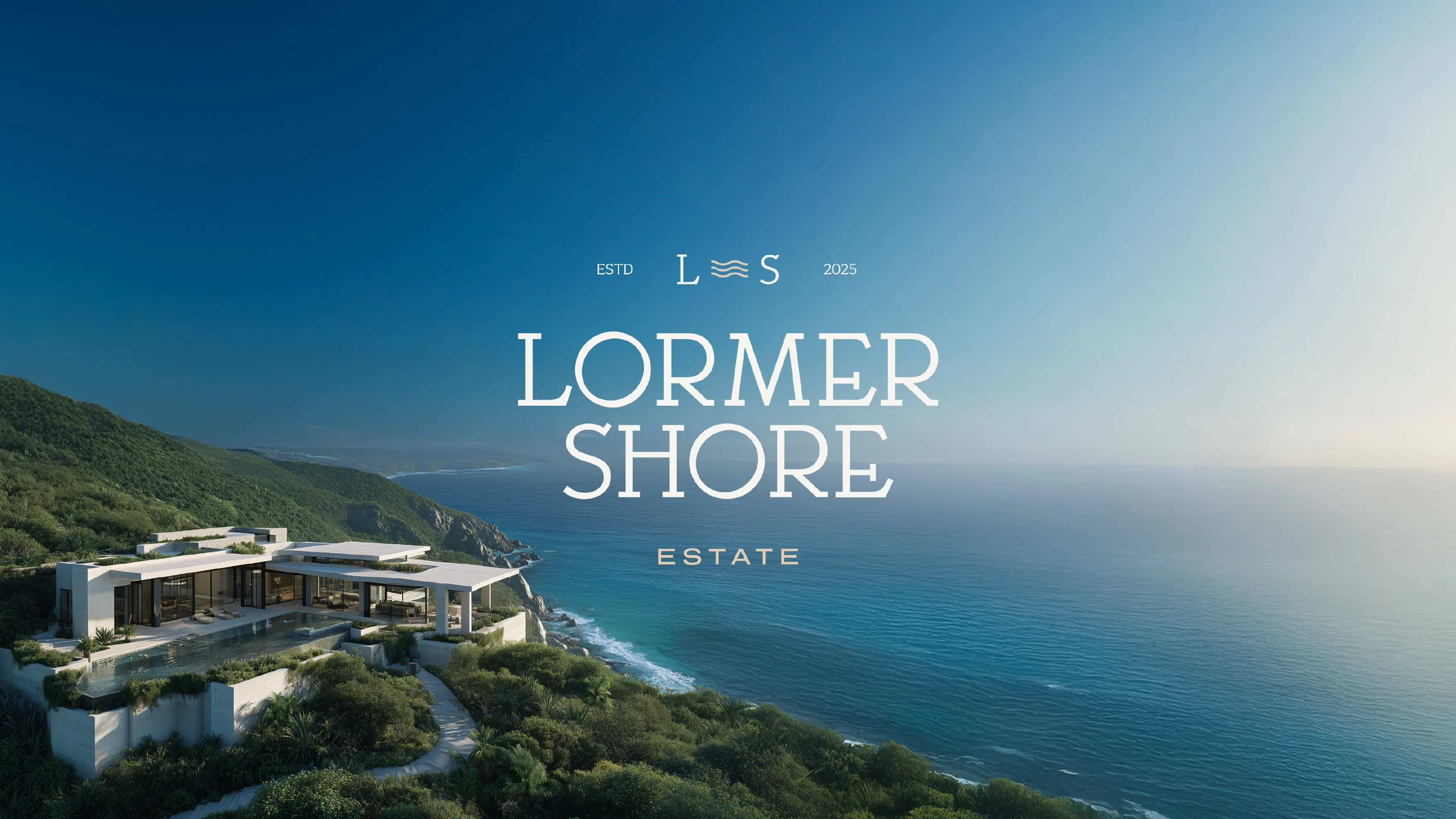
Lormer Shore needed to feel like nature's canvas and someone's future home, at the same time.
A coastal residential development needed textures, color, and a structural system considered enough to hold both a landscape and a home. Here's the identity system we built.




Pain Point
A brand built on nature as its canvas can't look like it came out of a real estate template.
A coastal development selling a life among nature can't lean on generic real estate branding, navy blazers, gold serif logos, glossy brochure cliches. Lormer Shore's whole value proposition rested on its relationship to the land itself: its textures, its colors, its light. The identity needed to feel like it was drawn from the place, not layered onto a template used for every other high-end development. And a brand this considered couldn't stop at a logo, it had to survive across dozens of physical touchpoints, vehicles, uniforms, ID cards, diaries, without ever feeling generic.
“A brand built on ‘nature’s canvas’ can't look like it came out of a template. It has to look like it grew out of the land.”
Services deployed
Execution



We established ‘nature’s canvas, people’s future home’ as the core idea everything else would be built from.
We built unique, relatable textures and a nature-driven palette, desert tones, cobalt blue, rich black, so the identity felt drawn from the place, not applied over it.
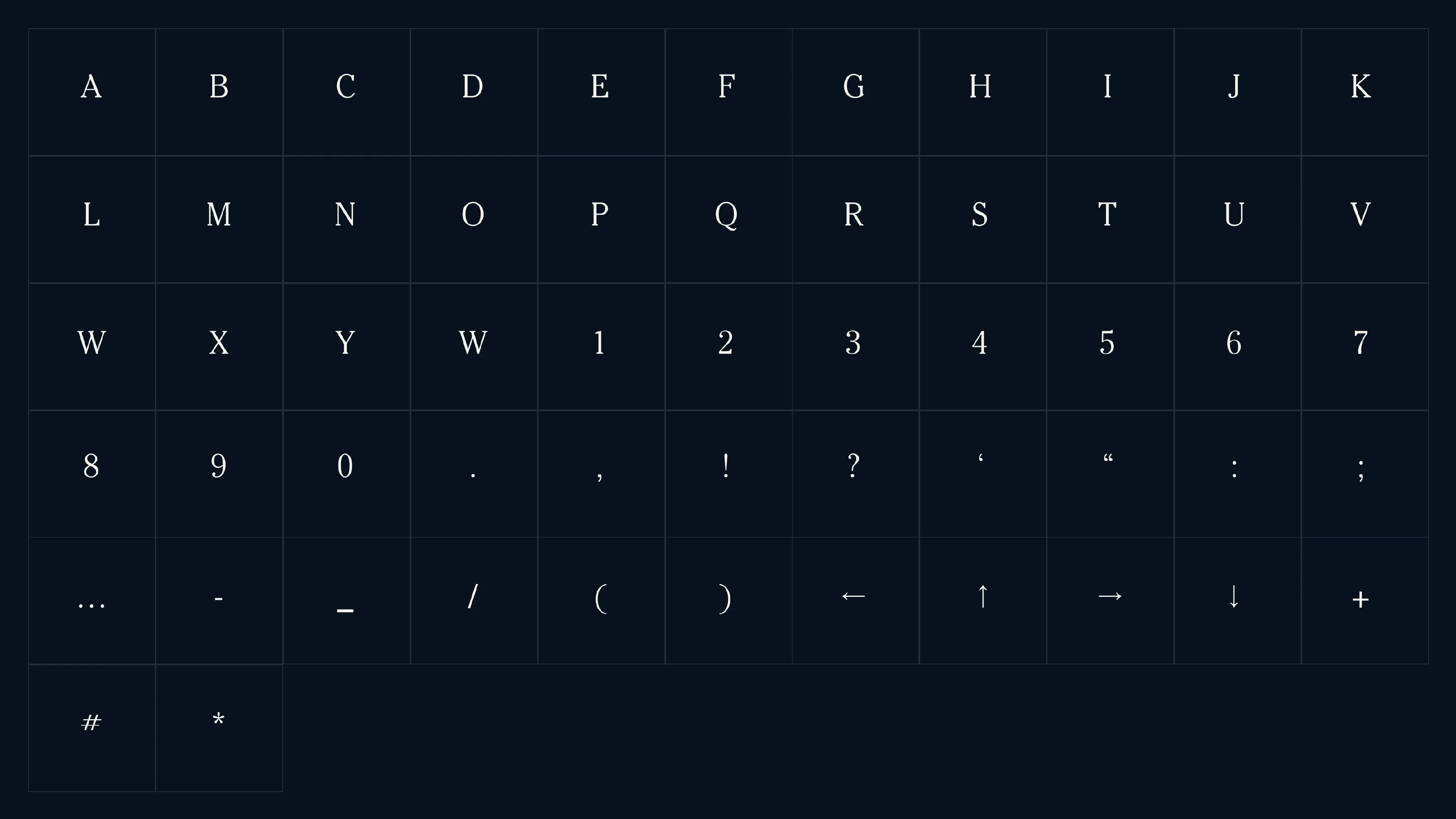
We developed a unique grid system as the foundation for every layout, then built the logo and core visual identity to sit naturally within that structure.
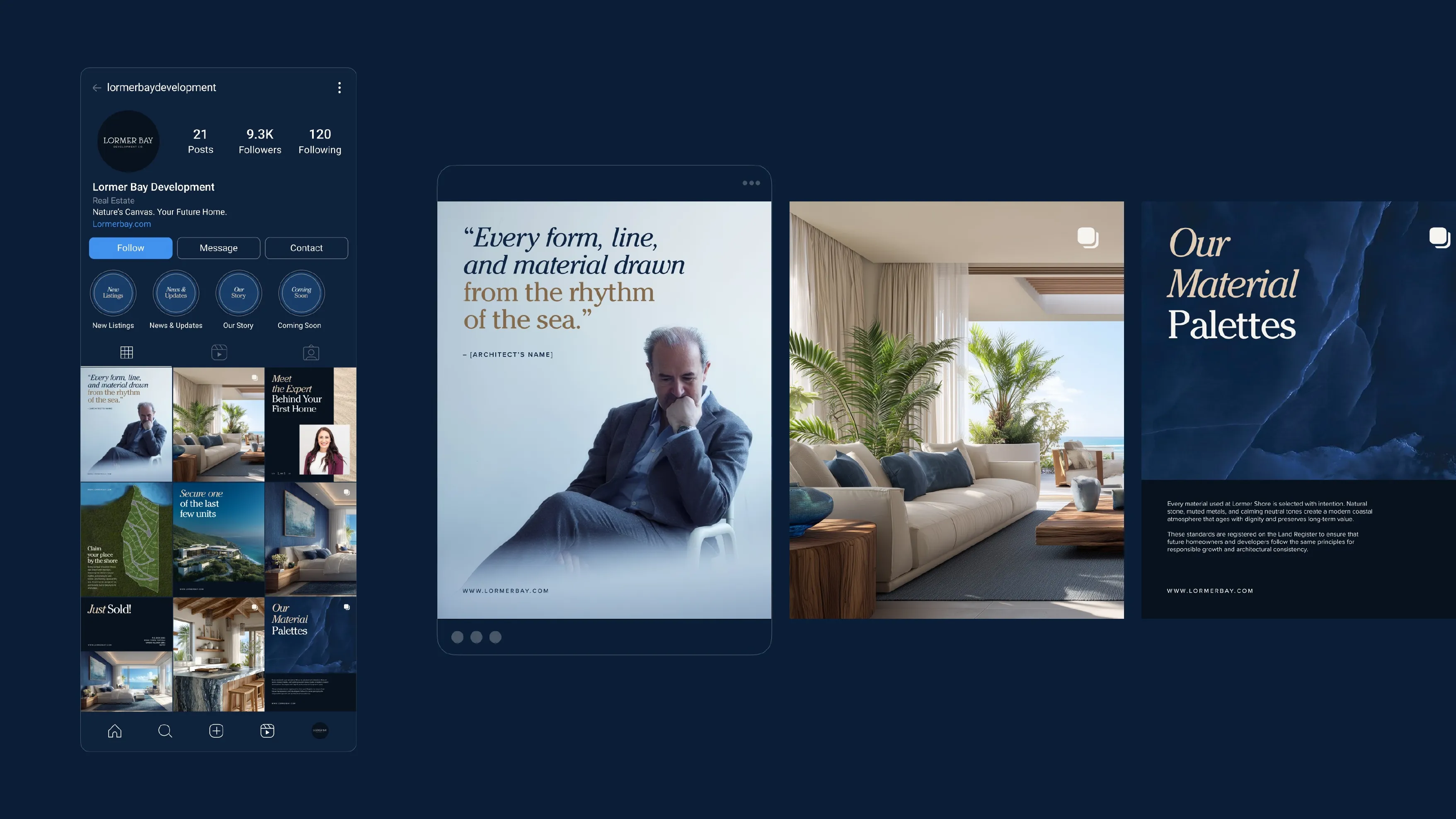
We took the system into vehicle and carrier design, strip design, ID cards, tote bags, diaries, uniforms, visiting cards, a social media lookbook, interior direction, and envelopes.


Before & After
Before
After
Undefined
Undefined
No defined grid system
No logo or system
Undefined
Risked reading as a generic real estate template