AI MARKETING TECH

B2B SAAS

AI/TECH/APP BRAND IDENTITY

An AI tech company wanted a brand identity as intelligent as its product.

An AI-powered marketing automation platform needed a brand identity that lived up to its own name, and an app design system ready before a single screen was built. Here's what we built.
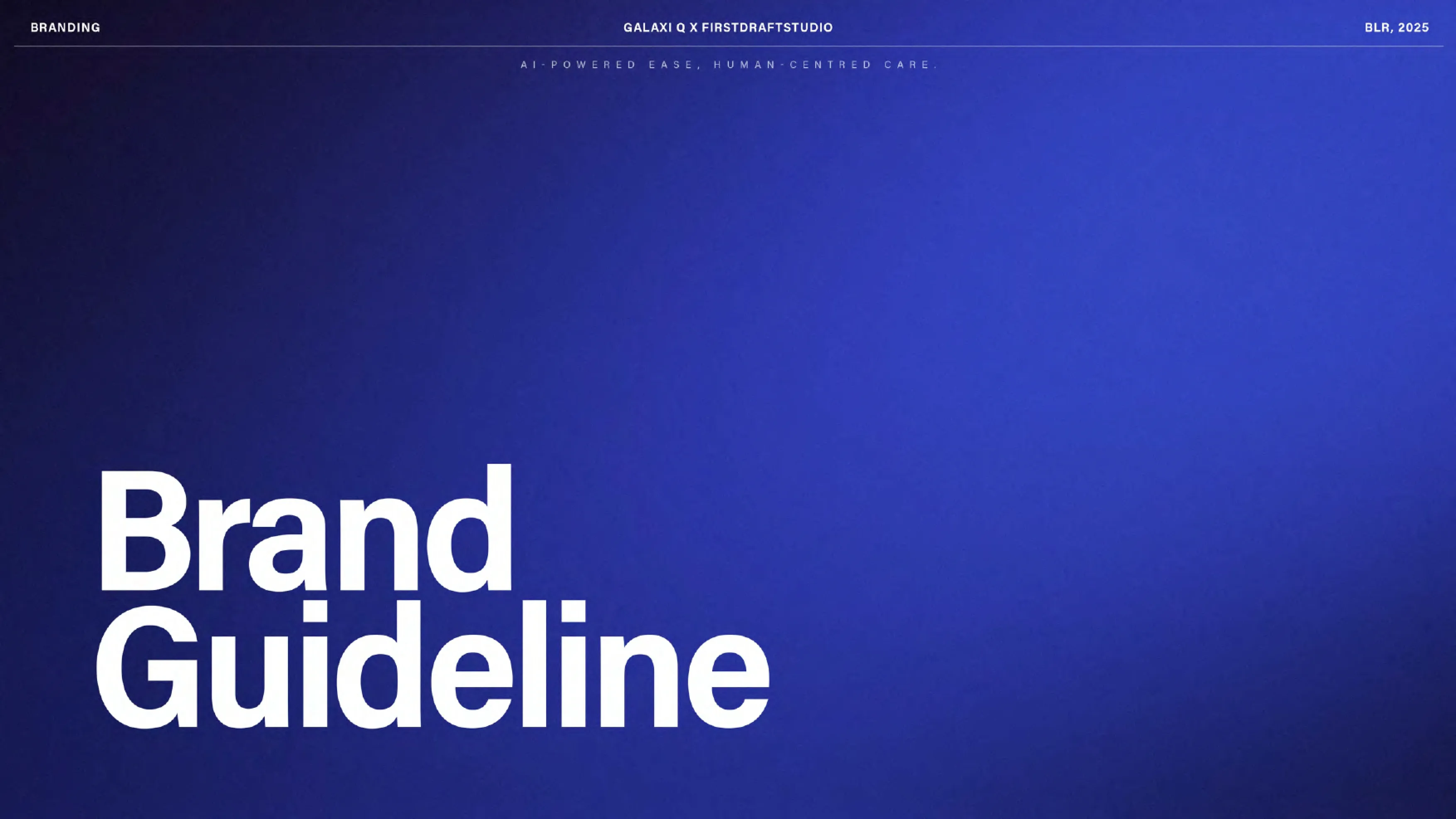
CATEGORY

An AI-powered marketing automation platform (AI-MOS) built around human-centered care, not automation for its own sake.

CATEGORY

An AI-powered marketing automation platform (AI-MOS) built around human-centered care, not automation for its own sake.

NAME

A brand name, GalaxiQ, that invited an obvious ‘space’ visual cliché, and needed a considered version of that idea instead.

NAME

A brand name, GalaxiQ, that invited an obvious ‘space’ visual cliché, and needed a considered version of that idea instead.

BRIEF

A specific direction from the client: blue-led, galaxy-inspired, without tipping into generic sci-fi visuals.

BRIEF

A specific direction from the client: blue-led, galaxy-inspired, without tipping into generic sci-fi visuals.

AMBITION

A brand system built ahead of an unreleased app, ready before a single production screen existed.

AMBITION

A brand system built ahead of an unreleased app, ready before a single production screen existed.

Pain Point

Most AI brands look automated. GalaxiQ needed to look human-centered while selling automation.

AI brands default to a familiar visual language: cold gradients, sterile interfaces, imagery that reads as efficient but impersonal. GalaxiQ's whole premise worked against that default, an AI-powered marketing platform built around human-centered care, not automation for its own sake. A generic ‘AI blue’ identity would have said the opposite of what the product actually believed. The brief needed to hold two things at once: a visual system that felt genuinely intelligent and premium, and one that never tipped into the cold, robotic look the rest of the category defaults to. On top of that, GalaxiQ had an app coming that didn't exist yet, so the identity needed to work inside a real interface, across both light and dark modes, before a single production screen was built.

“A brand that sells automation can't afford to look automated. GalaxiQ needed to feel intelligent and human at the same time.”

Services deployed
BRAND STRATEGY & MESSAGING
VISUAL IDENTITY & COLOR SYSTEM
TYPOGRAPHY DESIGN
TYPOGRAPHY DESIGN
TYPOGRAPHY DESIGN
APP UI DIRECTION (DARK/LIGHT)
ICONOGRAPHY MOOD BOARD
SOCIAL & APP LAYOUT DESIGN
UGC & INFLUENCER MARKETING

Execution

The team behind it

Brand strategists, identity designers, and UI/product designers worked the system together, from strategy through to app-ready screens.

The team behind it

Brand strategists, identity designers, and UI/product designers worked the system together, from strategy through to app-ready screens.

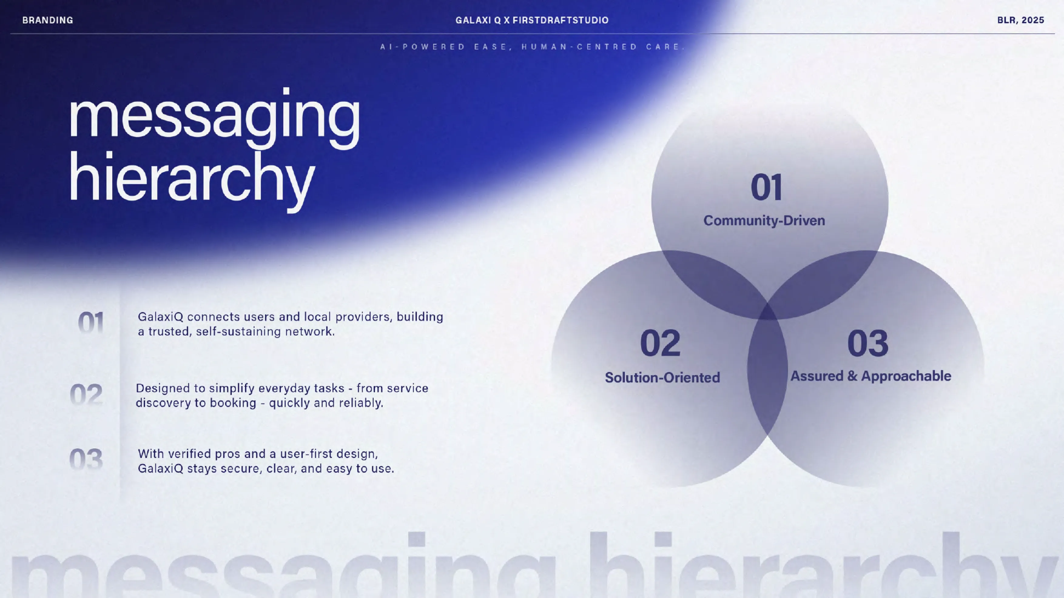
We built the story, values, brand keywords, tagline, messaging hierarchy, mission statement, tone of voice, and target audience before any visual exploration began.

We took the brand’s own name and built a blue gradient, galaxy-inspired visual language, considered rather than literal, so it read as identity, not decoration.

We defined the full palette; galaxy blues, silvers, orbit black, and pure white, alongside a complete typography system with clear usage rules.

We developed the app’s splash screens, logo lockup, social layouts, and app layouts, then defined dedicated dark and light mode directions alongside a full iconography system.

01

Built the brand strategy: story, values, keywords, tagline, messaging, mission, tone of voice, audience.

Before any visual work, GalaxiQ needed a clearly defined foundation. We built the full brand strategy layer, giving every later design decision something concrete to be right about.

03

Locked the color palette and typography system.

Per the brief, the palette stayed disciplined: galaxy blues, silvers, orbit black, and pure white, paired with a full typography system built for consistency across every touchpoint.

02

Turned the brand's own name into a considered, non-literal galaxy visual language.

The obvious ‘galaxy’ treatment is a cliché. We built a blue gradient galaxy-inspired look and feel specific enough to feel intentional, not like generic space stock art.

What we did

05

Built the brand strategy: story, values, keywords, tagline, messaging, mission, tone of voice, audience.

A single mode isn't enough for a modern app. We built a dedicated mood board for both dark mode and light mode, plus a complete iconography system, so the product would feel intentional in either state.

04

Designed splash screens, logo lockup, social layouts, and app layouts ahead of production.

GalaxiQ's app didn't exist yet. We designed splash screens, the logo lockup, social media layouts, and app layouts in advance, giving the product team a real visual reference before development started.

Before & After

Before

After

Brand strategy

Undefined

Full story, values, keywords, tagline, mission, tone of voice, audience

Full story, values, keywords, tagline, mission, tone of voice, audience

Visual concept

Just a name with an obvious theme risk

A considered, non-literal galaxy visual language

A considered, non-literal galaxy visual language

Color & typography

Undefined

Locked palette (blues, silvers, orbit black, white) plus type system

Locked palette (blues, silvers, orbit black, white) plus type system

App direction

No app yet, no visual reference

Splash screens, logo lockup, social and app layouts designed ahead of build

Splash screens, logo lockup, social and app layouts designed ahead of build

UI modes

Undefined

Dedicated dark mode and light mode direction

Dedicated dark mode and light mode direction

Iconography

Undefined

A complete iconography mood board

A complete iconography mood board

The name already had the idea inside it. The system is what kept that idea from becoming a cliché.

The name already had the idea inside it. The system is what kept that idea from becoming a cliché.

The name already had the idea inside it. The system is what kept that idea from becoming a cliché.

Results

1

Full Brand Strategy

4

Core Palette Families

2

UI Modes (Dark + Light)

1

Complete Iconography System

1

Full Brand Strategy

4

Core Palette Families

2

UI Modes (Dark + Light)

1

Complete Iconography System

Beyond the numbers

A galaxy-inspired identity that reads as intentional, not like generic space-themed stock art

An app design direction the product team can build against, instead of guessing at visual decisions mid-development

A brand that holds up in both dark and light mode, not just one primary UI state

Image
Image
Image

This wasn't a logo project. It was making sure GalaxiQ's own name became an asset instead of a cliché waiting to happen.

This wasn't a logo project. It was making sure GalaxiQ's own name became an asset instead of a cliché waiting to happen.

Takeaways for Brand

Takeaways for Brand

Pin icon image

A Visual Name Is a Gift and a Trap

The obvious version is usually the cliché version.

Pin icon image

Strategy Has to Come Before the Visual Idea

Otherwise the visual idea has nothing to be right about.

Pin icon image

Design the System, Not Just the Screen

Rules travel further than one mockup.

Pin icon image

Dark & Light Modes Need Equal Intent

They’re two versions of the same brand that both have to feel intentional.

Pin icon image

Iconography Deserves Logo-Level Rigor

It’s what a user sees hundreds of times a day, far more often than the logo itself.

Pin icon image

A Visual Name Is a Gift and a Trap

The obvious version is usually the cliché version.

Pin icon image

Design the System, Not Just the Screen

Rules travel further than one mockup.

Pin icon image

Iconography Deserves Logo-Level Rigor

It’s what a user sees hundreds of times a day, far more often than the logo itself.

Pin icon image

Strategy Has to Come Before the Visual Idea

Otherwise the visual idea has nothing to be right about.

Pin icon image

Dark & Light Modes Need Equal Intent

They’re two versions of the same brand that both have to feel intentional.

01

Built the brand strategy: story, values, keywords, tagline, messaging, mission, tone of voice, audience.

Before any visual work, GalaxiQ needed a clearly defined foundation. We built the full brand strategy layer, giving every later design decision something concrete to be right about.

02

Turned the brand's own name into a considered, non-literal galaxy visual language.

The obvious ‘galaxy’ treatment is a cliché. We built a blue gradient galaxy-inspired look and feel specific enough to feel intentional, not like generic space stock art.

03

Locked the color palette and typography system.

Per the brief, the palette stayed disciplined: galaxy blues, silvers, orbit black, and pure white, paired with a full typography system built for consistency across every touchpoint.

04

Designed splash screens, logo lockup, social layouts, and app layouts ahead of production.

GalaxiQ's app didn't exist yet. We designed splash screens, the logo lockup, social media layouts, and app layouts in advance, giving the product team a real visual reference before development started.

05

Built the brand strategy: story, values, keywords, tagline, messaging, mission, tone of voice, audience.

A single mode isn't enough for a modern app. We built a dedicated mood board for both dark mode and light mode, plus a complete iconography system, so the product would feel intentional in either state.

What we did
Portfolio image
Portfolio image

Ready to look like you're already winning?

Ready to look like you're already winning?

Tell us about your project whether it’s a Website, Branding, or Social Media.

Tell us about your project whether it’s a Website, Branding, or Social Media.

Dubai × Bengaluru

Limited Client Partnerships

Dubai × Bengaluru

Limited Client Partnerships

Available for work

Avatar
Avatar
Avatar
Avatar
Avatar
Avatar

Our team

#Creative Squad