INDIA

HIGHER EDUCATION & RESEARCH

LOGO & VISUAL IDENTITY STORY

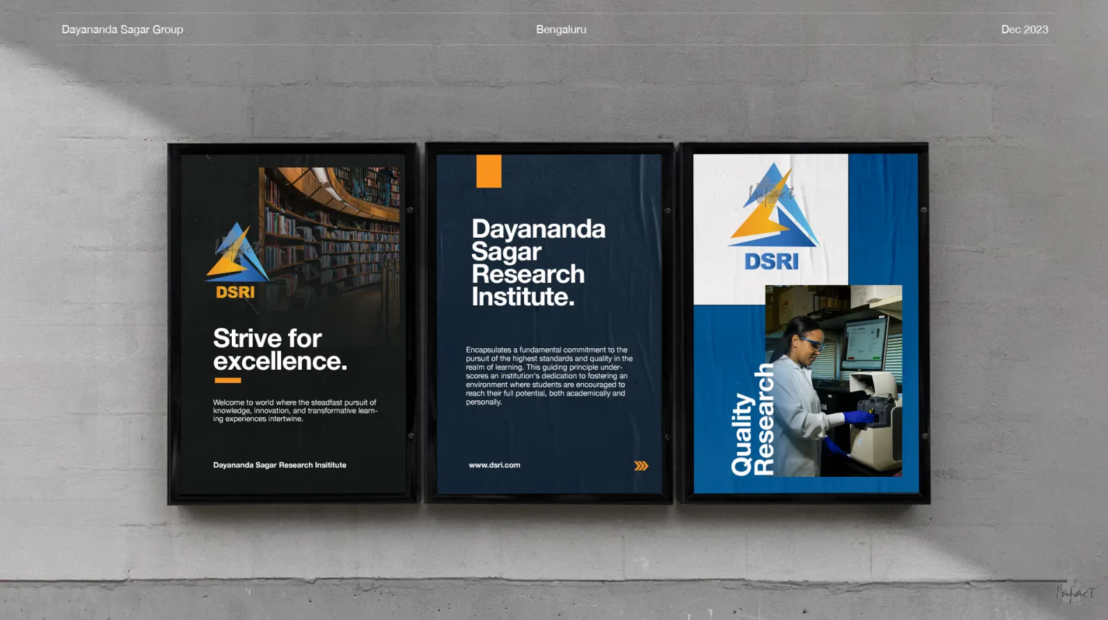
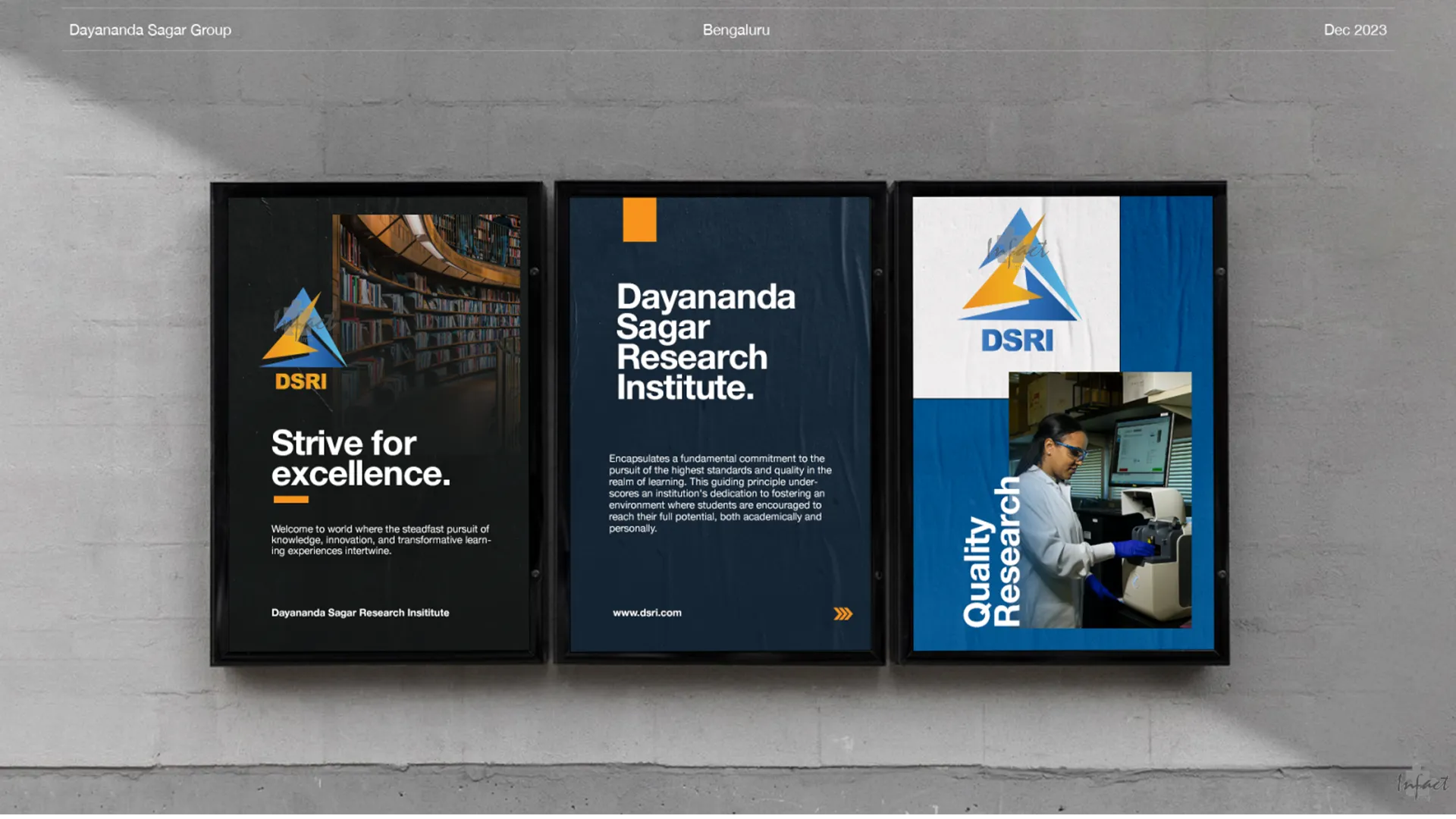
Dayananda Sagar Research Institute needed a brand that was unique, yet professional.

A Bengaluru research institute under the Dayananda Sagar Group needed a logo and colour system considered enough to represent excellence, wisdom, and creativity to stakeholders choosing its future identity. Here's the visual identity work we built.

ORIGIN

Part of the established Dayananda Sagar Group, DSRI needed a mark that could stand as its own credible identity within a respected institutional family.

ORIGIN

Part of the established Dayananda Sagar Group, DSRI needed a mark that could stand as its own credible identity within a respected institutional family.

CONCEPT DEPTH

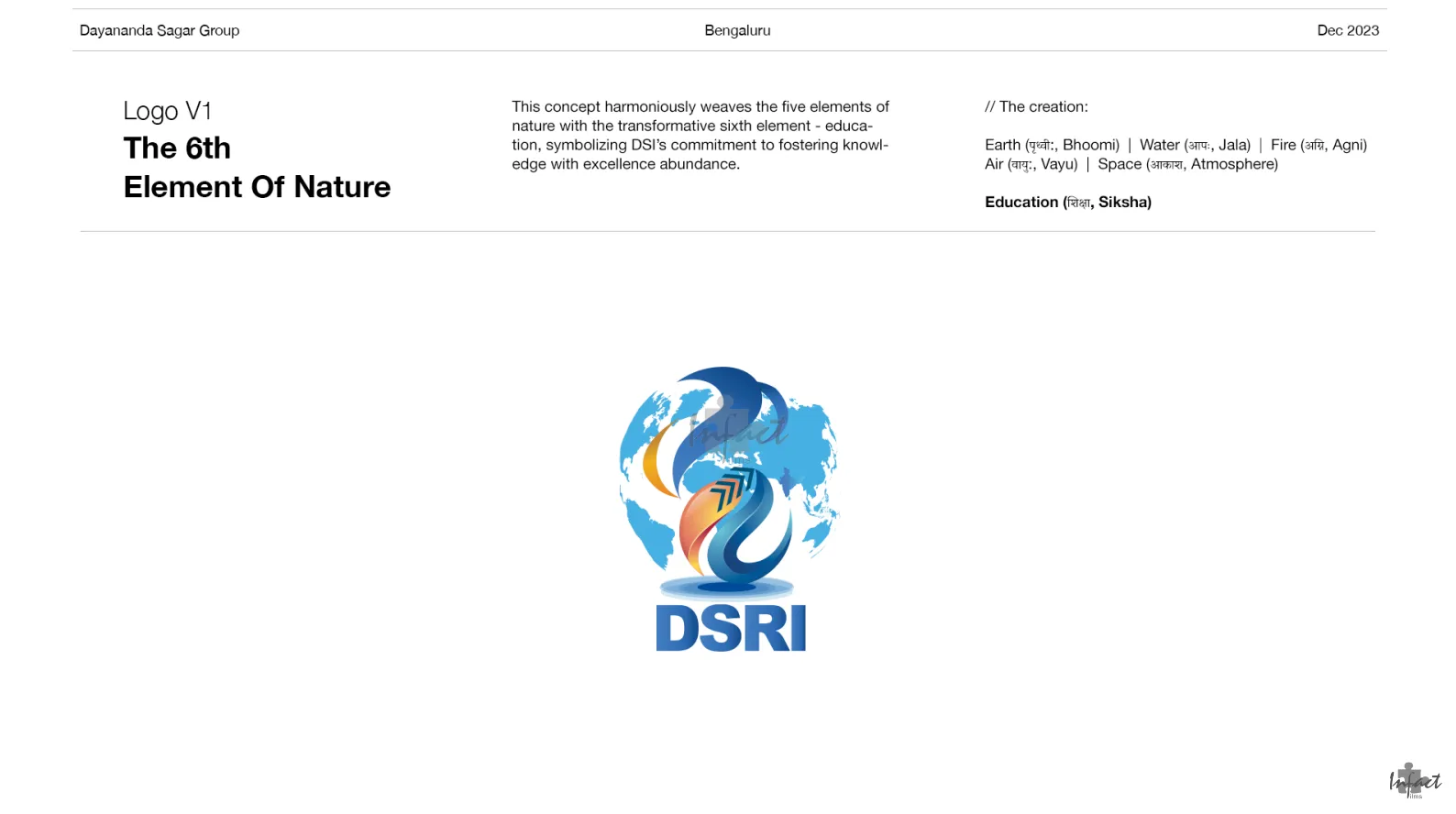
A logo grounded in the five classical elements of nature, Earth, Water, Fire, Air, and Space, unified by a sixth: education itself.

CONCEPT DEPTH

A logo grounded in the five classical elements of nature, Earth, Water, Fire, Air, and Space, unified by a sixth: education itself.

STAKEHOLDER PROCESS

Built explicitly as a visual guide for stakeholders to explore and choose between distinct directions, not a single take-it-or-leave-it design.

STAKEHOLDER PROCESS

Built explicitly as a visual guide for stakeholders to explore and choose between distinct directions, not a single take-it-or-leave-it design.

COLOUR MEANING

A palette of blues for wisdom and intelligence, paired with a citrus accent for creativity and enthusiasm, each shade with a defined institutional meaning.

COLOUR MEANING

A palette of blues for wisdom and intelligence, paired with a citrus accent for creativity and enthusiasm, each shade with a defined institutional meaning.

Pain Point

DSRI needed a mark meaningful enough for a research institute, without collapsing into visual clutter.

A research institute's logo carries a specific kind of pressure: it has to read as credible to academics, government bodies, and prospective students alike, while still saying something true about what the institute actually values. DSRI wanted a mark rooted in something deeper than decoration, the five classical elements of nature alongside education as a transformative sixth, a genuinely rich concept that risked becoming an overworked, illegible symbol if handled without discipline. On top of that, stakeholders needed real options to evaluate, not a single proposal to accept or reject, which meant developing more than one credible direction, each resolved fully enough to stand on its own. The challenge wasn't finding meaning to build into the mark. It was translating that meaning into a logo simple enough to actually work on a letterhead, an envelope, and a visiting card.

“A logo carrying five elements of nature and a sixth idea has one job above all others: still be legible as a mark, not just as a concept.”

Services deployed
LOGO CONCEPT DEVELOPMENT
COLOUR PALETTE DEVELOPMENT
MULTI-CONCEPT STAKEHOLDER PRESENTATION
STATIONERY & APPLICATION MOCKUPS
BRAND SYMBOLISM & RATIONALE
VISUAL IDENTITY DOCUMENTATION
UGC & INFLUENCER MARKETING

Execution

The team behind it

Brand and identity designers developed multiple resolved logo concepts and a supporting colour system for stakeholder review.

The team behind it

Brand and identity designers developed multiple resolved logo concepts and a supporting colour system for stakeholder review.

Shades of blue were chosen to represent wisdom and intelligence, paired with a citrus accent for creativity and enthusiasm, so every colour had a defined reason for being in the palette.

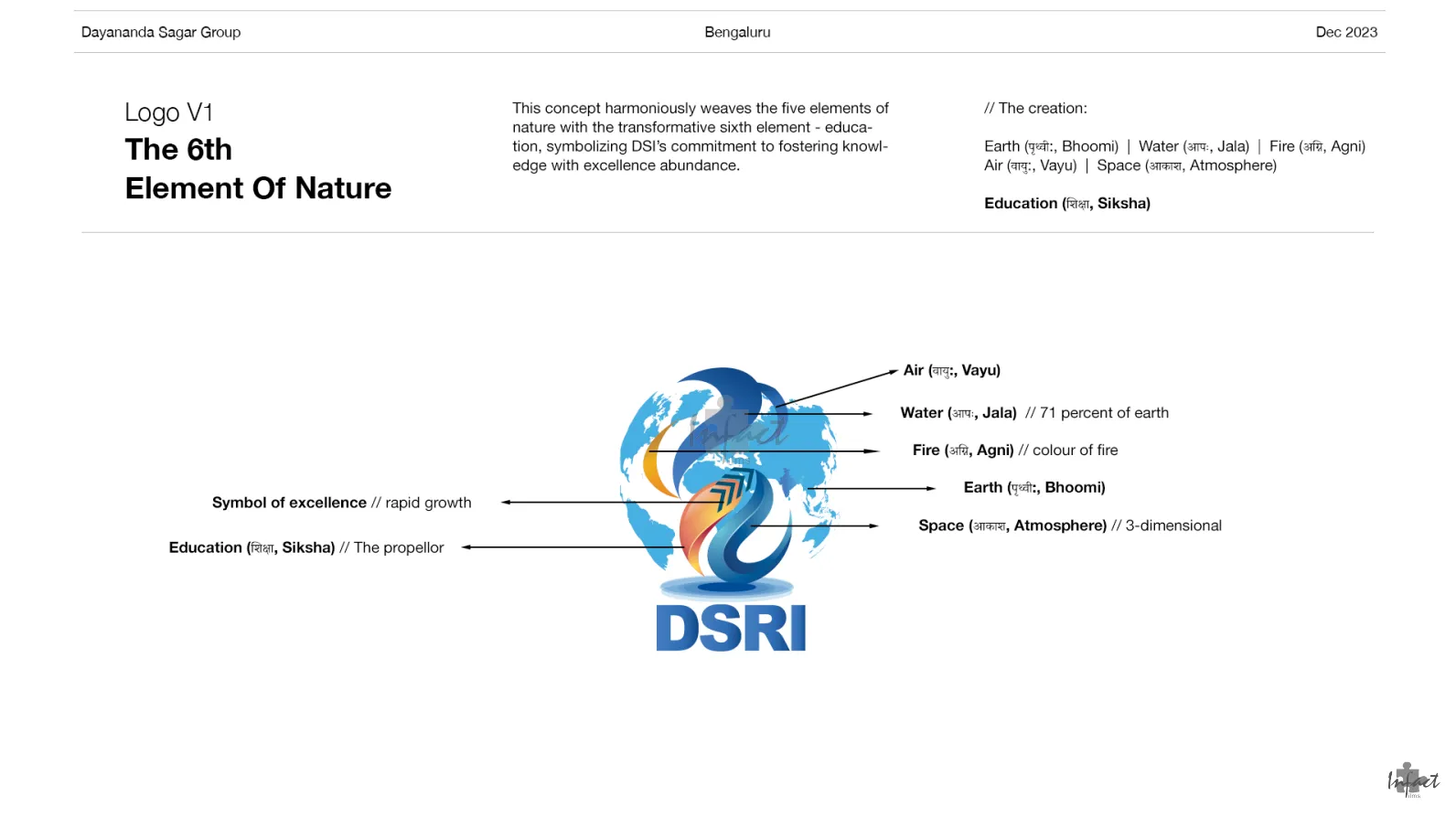
Earth, Water, Fire, Air, and Space were woven into the mark's form, with each element's placement and colour individually annotated and justified.

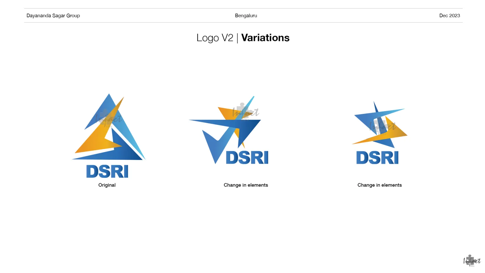
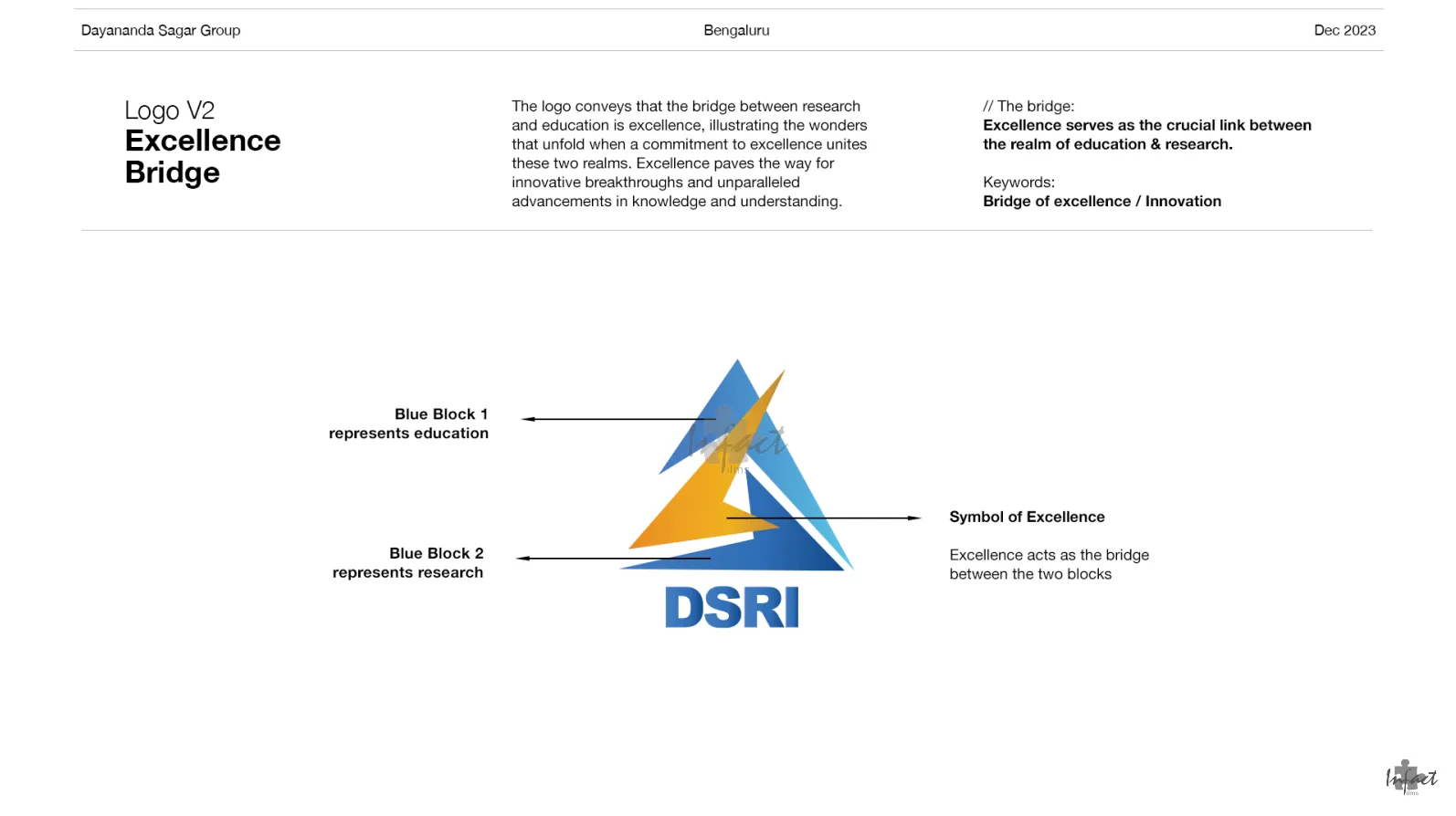
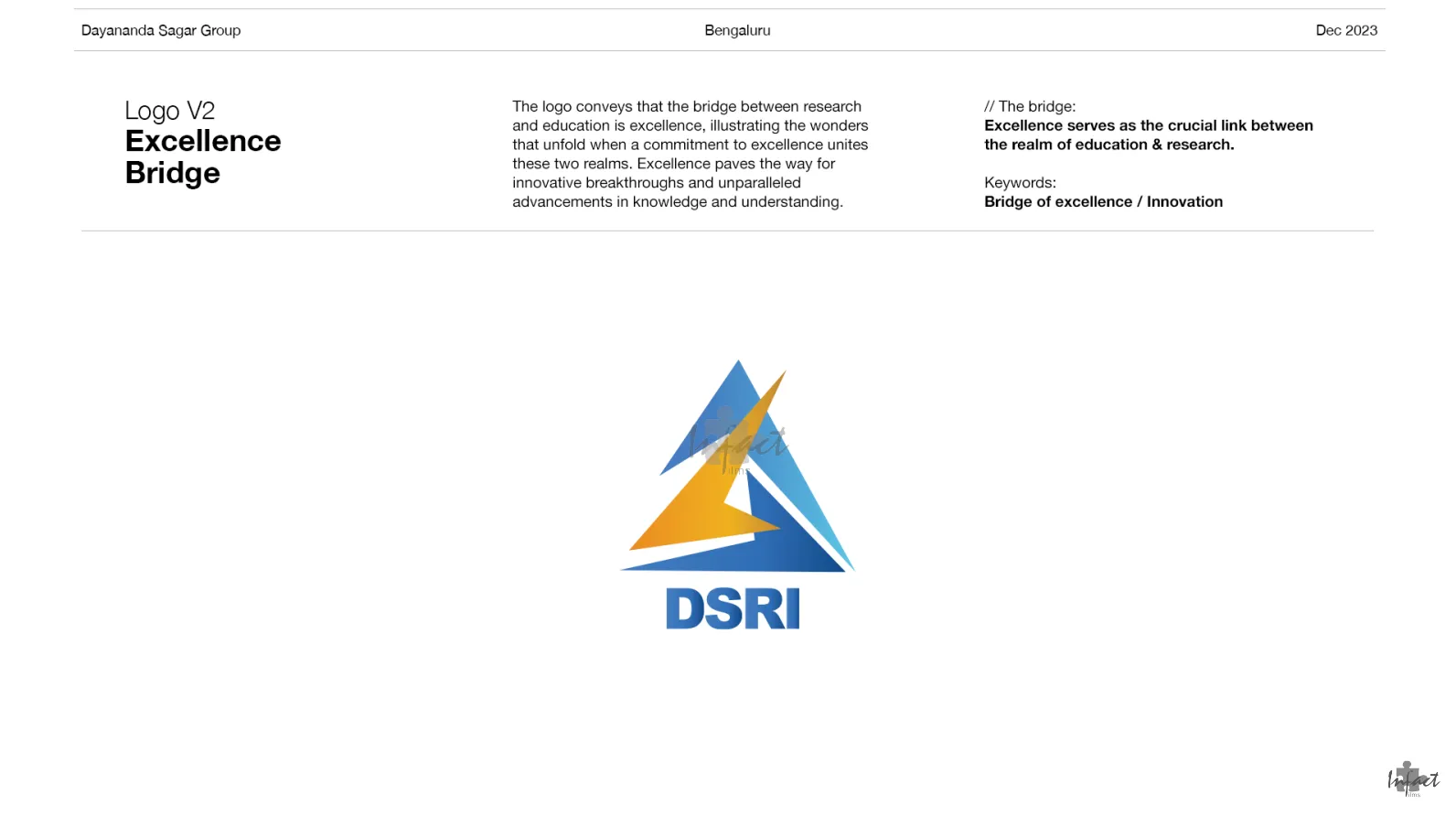
A separate direction represented education and research as two blocks united by excellence, giving stakeholders a genuinely different visual language to compare against the first.

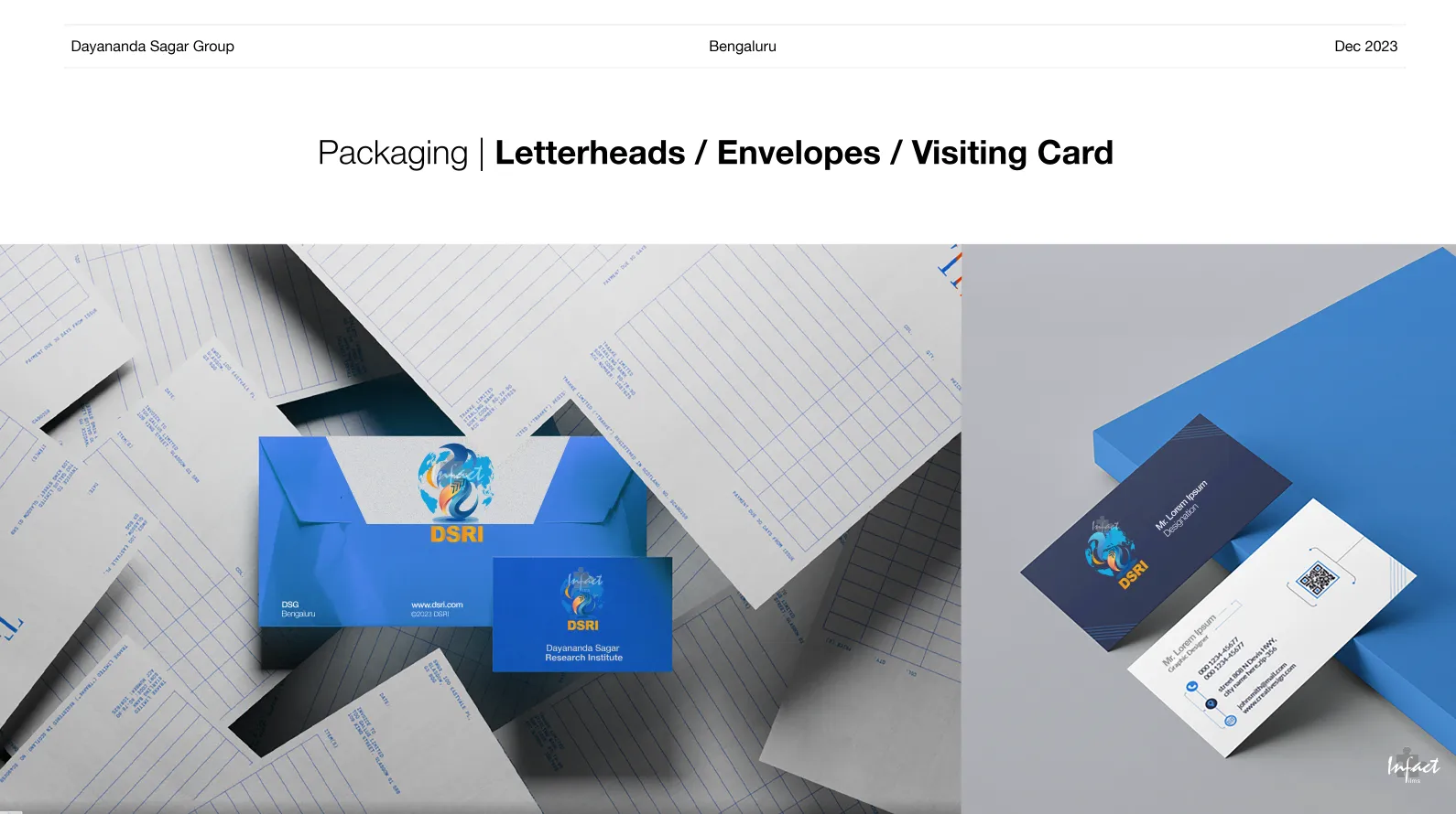
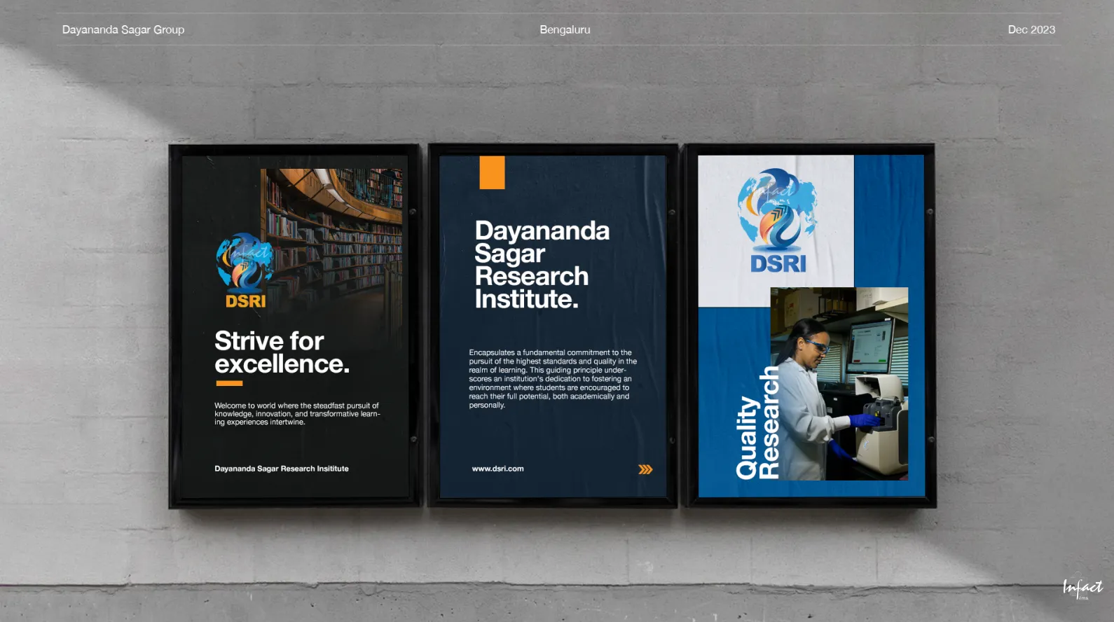
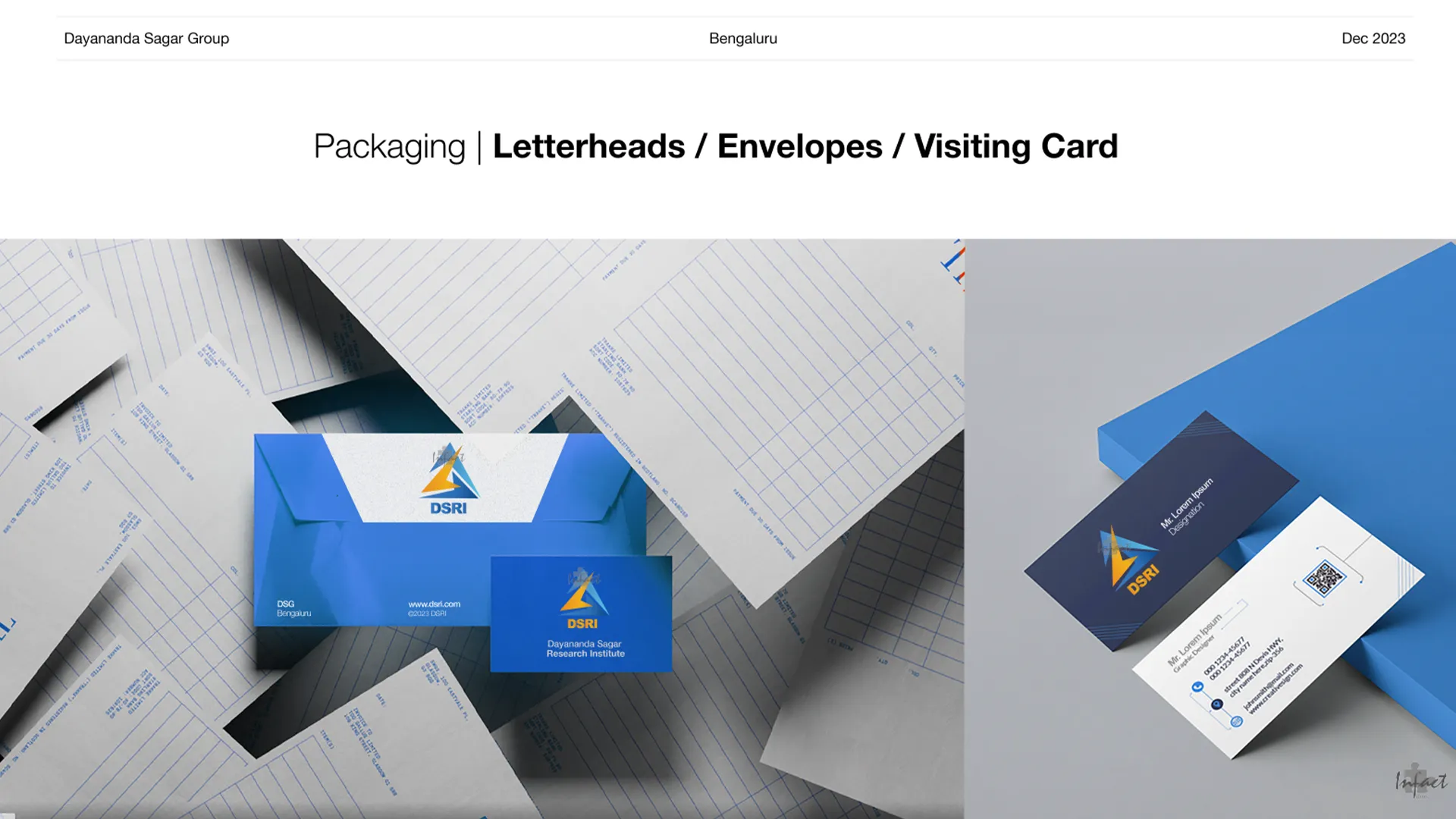
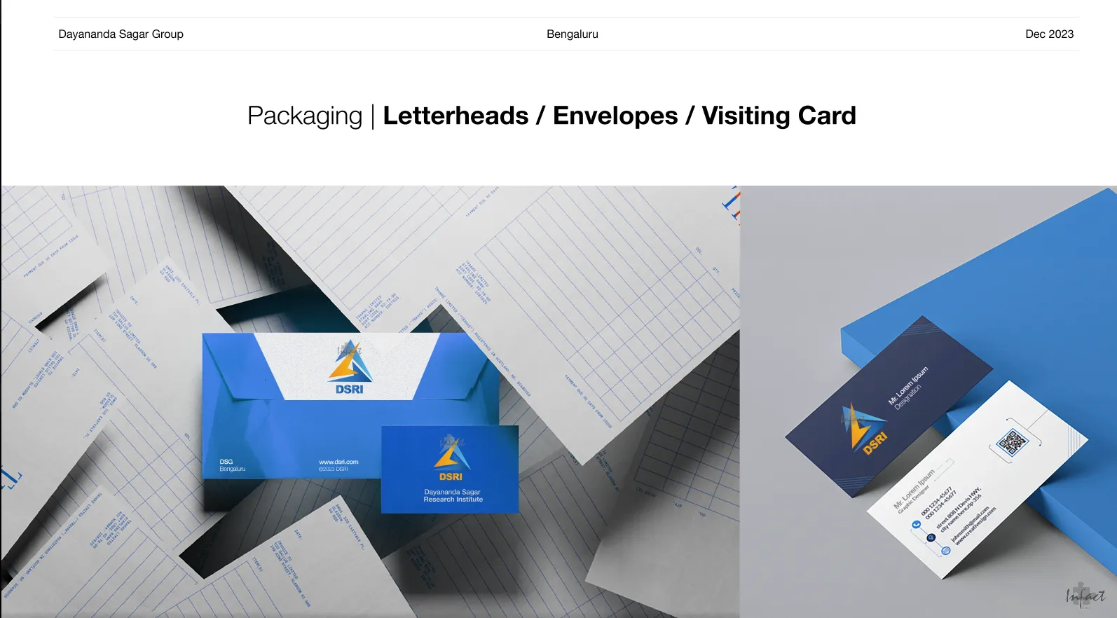
Letterheads, envelopes, and visiting cards were mocked up for each logo direction, so stakeholders could evaluate how each mark actually performed in practical use, not just as a standalone image.
01

01 Built a colour palette where every shade carried institutional meaning.

A research institute's colours shouldn't be chosen on instinct. We assigned blue tones to represent wisdom and intelligence, and a citrus accent to represent creativity and enthusiasm, so the palette itself communicated the institute's values.

03

03 Built a second, genuinely distinct concept for real comparison.

Stakeholders choosing an identity need real alternatives, not variations on one idea. We developed an entirely separate ‘Excellence Bridge’ concept, representing education and research as two blocks united by excellence, giving a real choice between two different visual languages.

02

02 Developed a primary concept weaving five natural elements into one mark.

Earth, Water, Fire, Air, and Space are a rich but risky foundation for a logo. We resolved each element into a specific, annotated part of the mark, with education added as a sixth, transformative element, keeping the symbolism precise rather than decorative.

What we did

05

01 Built a colour palette where every shade carried institutional meaning.

04

04 Mocked up both concepts across real stationery, not just standalone logos.

A logo that only looks good on a title slide isn't finished. We applied both directions to letterheads, envelopes, and visiting cards, so stakeholders could judge each mark by how it actually performed in daily institutional use.

Before & After

Before

After

Visual identity

No resolved logo or colour system

Two fully developed logo concepts, each with a defined colour palette

Two fully developed logo concepts, each with a defined colour palette

Symbolism

No documented meaning behind visual choices

Every element, colour, and shape tied to a specific, annotated rationale

Every element, colour, and shape tied to a specific, annotated rationale

Stakeholder choice

No comparable options to evaluate

Two distinct, fully resolved directions presented side by side

Two distinct, fully resolved directions presented side by side

Colour palette

Undefined

A blue-and-citrus system representing wisdom, intelligence, and creativity

A blue-and-citrus system representing wisdom, intelligence, and creativity

Real-world application

Logo shown only as a static mark

Both concepts mocked up across letterheads, envelopes, and visiting cards

Both concepts mocked up across letterheads, envelopes, and visiting cards

Institutional credibility

Risk of an overworked or generic academic mark

A considered, legible identity grounded in genuine institutional meaning

A considered, legible identity grounded in genuine institutional meaning

The depth of meaning was never the risk. Keeping that meaning legible as an actual, usable mark, was.

The depth of meaning was never the risk. Keeping that meaning legible as an actual, usable mark, was.

The depth of meaning was never the risk. Keeping that meaning legible as an actual, usable mark, was.

Results

2

Fully Resolved Logo Concepts Delivered

4

Colours in the Core Palette

6

Symbolic Elements Woven Into the Primary Mark

10+

Stationery/Collaterals Delivered

2

Fully Resolved Logo Concepts Delivered

4

Colours in the Core Palette

6

Symbolic Elements Woven Into the Primary Mark

10+

Stationery/Collaterals Delivered

Beyond the numbers

A genuinely rich concept, five elements of nature plus education, made legible as an actual usable mark, not just an idea

Two real, distinct directions for stakeholders to compare, rather than one proposal to accept or reject

Both concepts proven out across real stationery, showing exactly how each would look in daily institutional use

Image
Image
Image

A genuinely rich concept, five elements of nature plus education, made legible as an actual usable mark, not just an idea

Two real, distinct directions for stakeholders to compare, rather than one proposal to accept or reject

Both concepts proven out across real stationery, showing exactly how each would look in daily institutional use

Image
Image
Image

A genuinely rich concept, five elements of nature plus education, made legible as an actual usable mark, not just an idea

Two real, distinct directions for stakeholders to compare, rather than one proposal to accept or reject

Both concepts proven out across real stationery, showing exactly how each would look in daily institutional use

Image
Image
Image

This wasn't a logo delivery. It was giving a research institute's stakeholders the tools to choose an identity with confidence, backed by real symbolism and real application.

This wasn't a logo delivery. It was giving a research institute's stakeholders the tools to choose an identity with confidence, backed by real symbolism and real application.

Takeaways for Brand

Takeaways for Brand

Pin icon image

A logo with deep symbolism still has to work as a mark first.

Meaning that can't be read at a glance doesn't do its job.

Pin icon image

Stakeholders deserve real alternatives, not variations on one idea.

Two genuinely distinct concepts allow an actual choice, not a rubber stamp.

Pin icon image

Every colour in an institutional palette should carry a stated meaning.

Wisdom, intelligence, creativity, whatever the values are, the palette should say so.

Pin icon image

A logo isn't finished until it's tested on real applications.

A mark that only works on a slide can still fail on a letterhead or business card.

Pin icon image

Documenting the rationale behind design choices builds stakeholder confidence.

An annotated ‘why’ does more convincing than the visual alone.

Pin icon image

A logo with deep symbolism still has to work as a mark first.

Meaning that can't be read at a glance doesn't do its job.

Pin icon image

Every colour in an institutional palette should carry a stated meaning.

Wisdom, intelligence, creativity, whatever the values are, the palette should say so.

Pin icon image

Documenting the rationale behind design choices builds stakeholder confidence.

An annotated ‘why’ does more convincing than the visual alone.

Pin icon image

Stakeholders deserve real alternatives, not variations on one idea.

Two genuinely distinct concepts allow an actual choice, not a rubber stamp.

Pin icon image

A logo isn't finished until it's tested on real applications.

A mark that only works on a slide can still fail on a letterhead or business card.

01

01 Built a colour palette where every shade carried institutional meaning.

A research institute's colours shouldn't be chosen on instinct. We assigned blue tones to represent wisdom and intelligence, and a citrus accent to represent creativity and enthusiasm, so the palette itself communicated the institute's values.

02

02 Developed a primary concept weaving five natural elements into one mark.

Earth, Water, Fire, Air, and Space are a rich but risky foundation for a logo. We resolved each element into a specific, annotated part of the mark, with education added as a sixth, transformative element, keeping the symbolism precise rather than decorative.

03

03 Built a second, genuinely distinct concept for real comparison.

Stakeholders choosing an identity need real alternatives, not variations on one idea. We developed an entirely separate ‘Excellence Bridge’ concept, representing education and research as two blocks united by excellence, giving a real choice between two different visual languages.

04

04 Mocked up both concepts across real stationery, not just standalone logos.

A logo that only looks good on a title slide isn't finished. We applied both directions to letterheads, envelopes, and visiting cards, so stakeholders could judge each mark by how it actually performed in daily institutional use.

05

01 Built a colour palette where every shade carried institutional meaning.
What we did
Portfolio image
Portfolio image

Ready to look like you're already winning?

Ready to look like you're already winning?

Tell us about your project whether it’s a Website, Branding, or Social Media.

Tell us about your project whether it’s a Website, Branding, or Social Media.

Dubai × Bengaluru

Limited Client Partnerships

Dubai × Bengaluru

Limited Client Partnerships

Available for work

Avatar
Avatar
Avatar
Avatar
Avatar
Avatar

Our team

#Creative Squad