SHAPEWEAR D2C

AMAZON-TO-BRAND STORY

BRAND IDENTITY BUILD

BodyBand was doing good revenue. It just wasn't a brand yet.

A shapewear brand with strong Amazon revenue needed an identity to match. Here's the brand system we built, and how it changed the way the client sees the business.
REVENUE

A shapewear brand already generating strong, consistent revenue, mostly through Amazon.

REVENUE

A shapewear brand already generating strong, consistent revenue, mostly through Amazon.

GAP

Real commercial traction with no defined brand identity behind it yet, an Amazon listing, not a brand.

GAP

Real commercial traction with no defined brand identity behind it yet, an Amazon listing, not a brand.

CATEGORY

A crowded shapewear market where undifferentiated products compete almost entirely on price and reviews.

CATEGORY

A crowded shapewear market where undifferentiated products compete almost entirely on price and reviews.

AMBITION

A client who wanted the business to start being seen, and run, as an actual brand.

AMBITION

A client who wanted the business to start being seen, and run, as an actual brand.

Pain Point

BodyBand was already winning on revenue. It just didn't have a brand behind any of it.

The commercial side was working: good, consistent revenue, real product-market fit, mostly earned through Amazon. But none of that success was backed by an actual brand, no defined tone, no tagline, no visual system, nothing beyond the product itself. It looked and felt like an Amazon listing that happened to sell well, not a brand a customer could recognize, trust, or feel any loyalty to beyond the next purchase. Revenue proves a product works. It doesn't build the second thing on its own.

“Revenue proves a product works. It doesn't make it a brand.”

Services deployed
BRAND TONE & MESSAGING
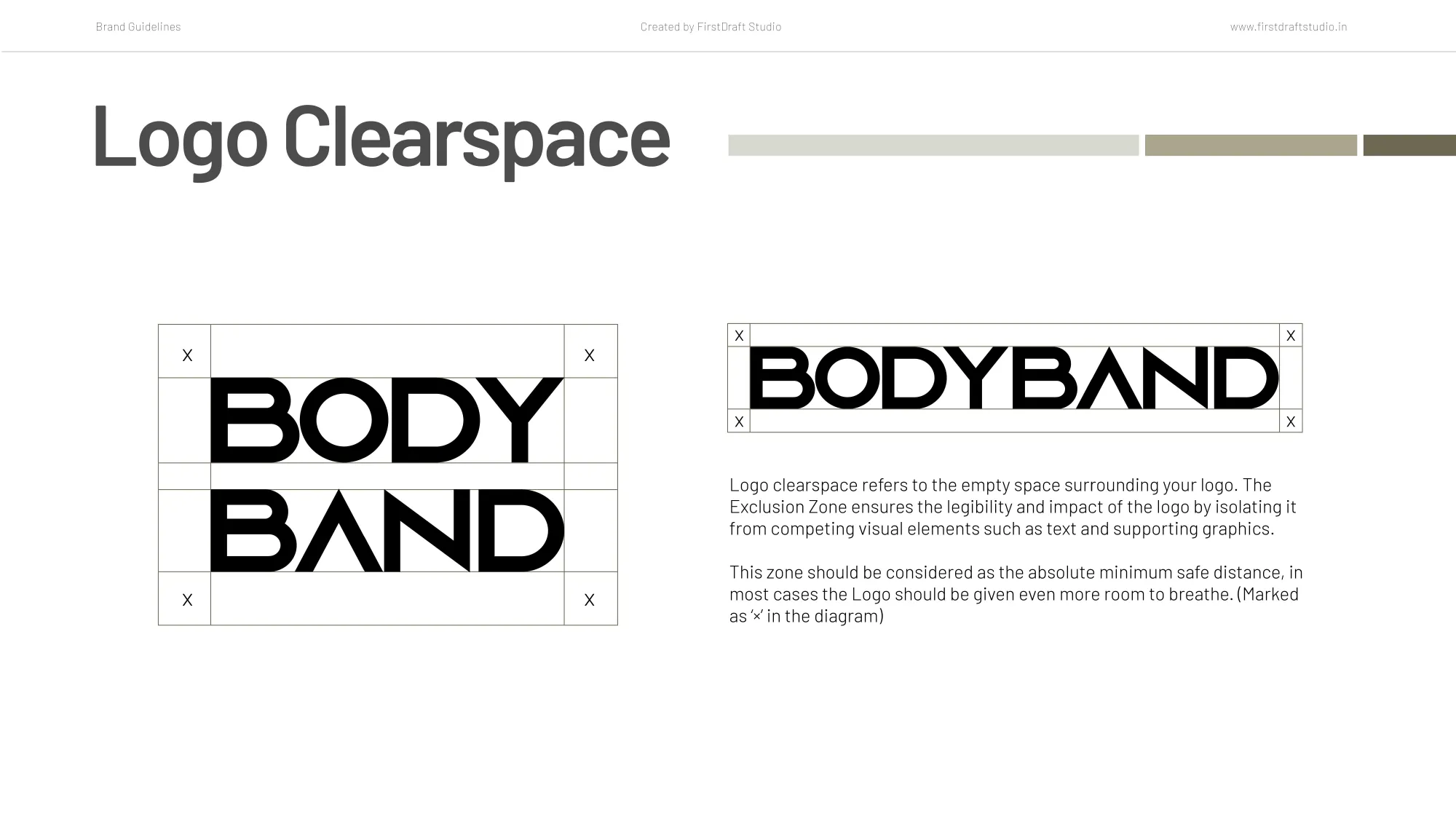
LOGO DESIGN & USAGE GUIDELINES
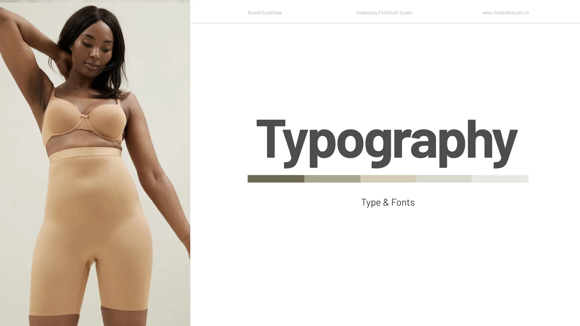
TYPOGRAPHY SYSTEM
TYPOGRAPHY SYSTEM
TYPOGRAPHY SYSTEM
COLOR PALETTE DEVELOPMENT
PACKAGING DIRECTION
PACKAGING DIRECTION
PACKAGING DIRECTION
WEBSITE BRAND DIRECTION
UGC & INFLUENCER MARKETING

Execution

The team behind it

Brand strategists and identity designers built the identity system together, from tone of voice through to cross-medium direction.

The team behind it

Brand strategists and identity designers built the identity system together, from tone of voice through to cross-medium direction.

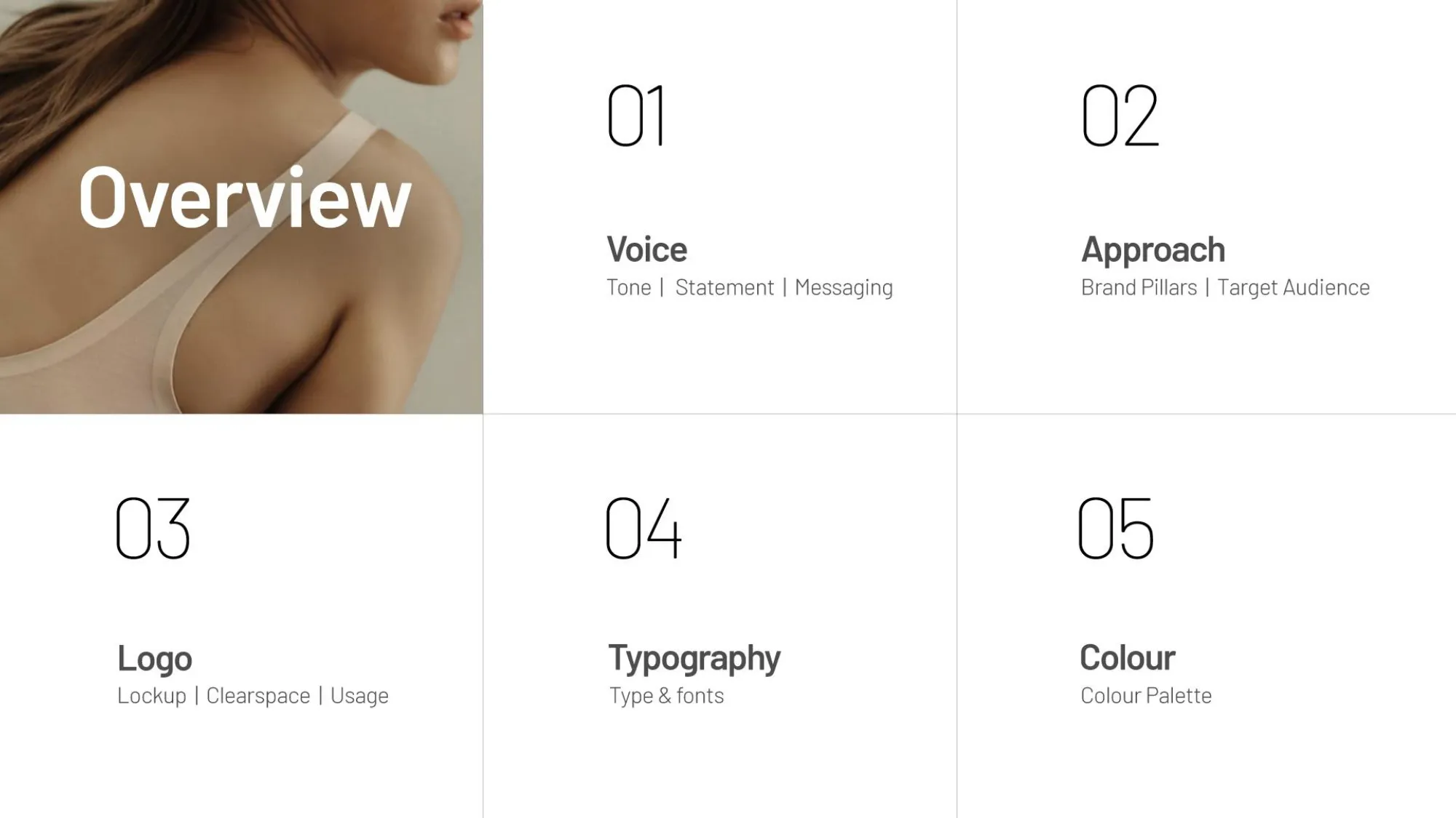
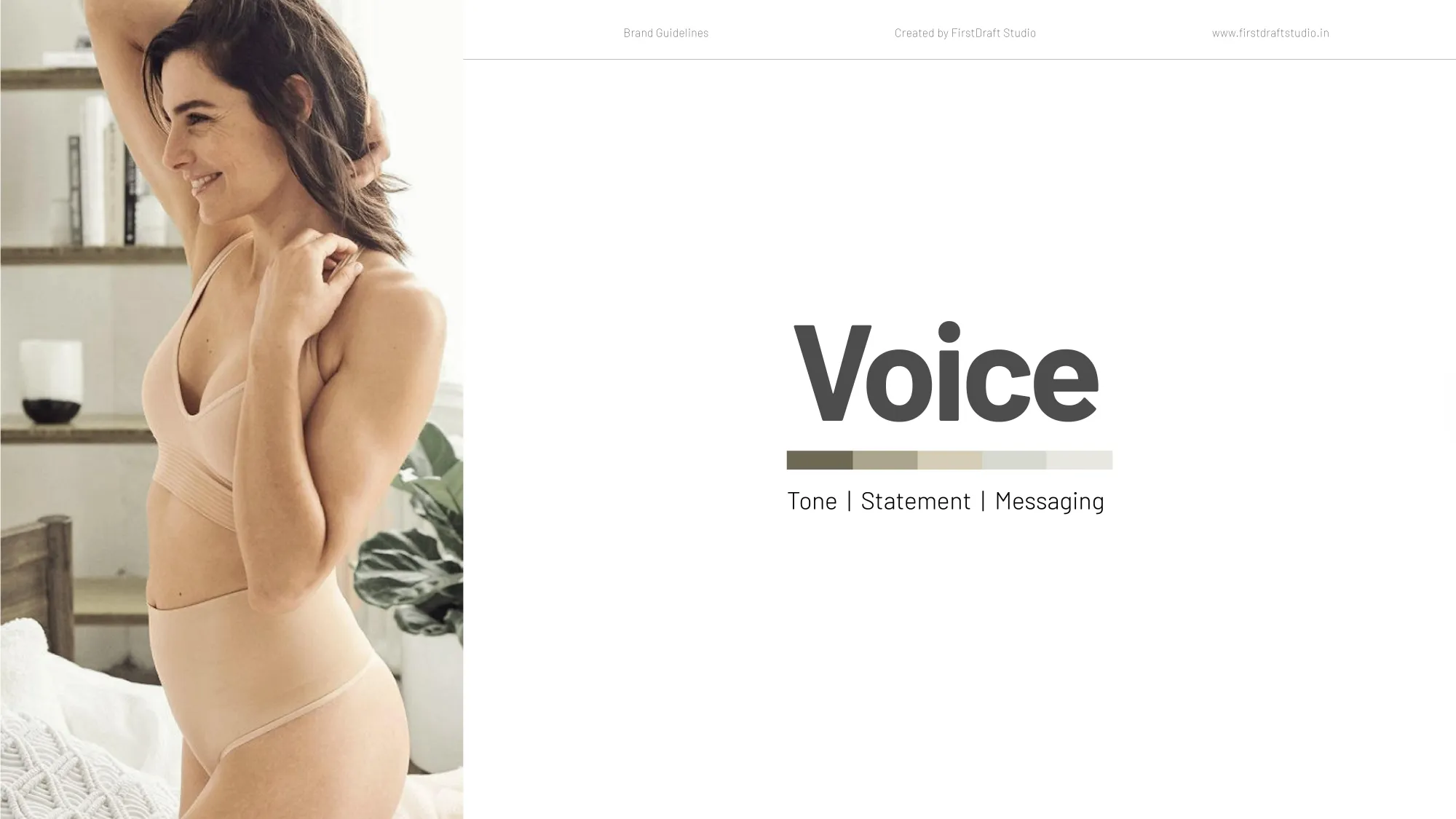
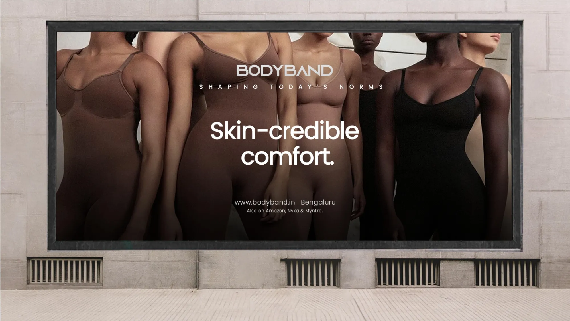
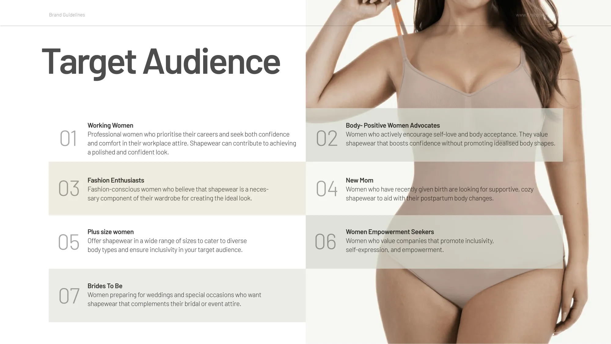
We established the brand’s tone of voice and tagline, “Skincredible Comfort,” as the foundation, then developed the core brand pillars and messaging framework around the target audience.

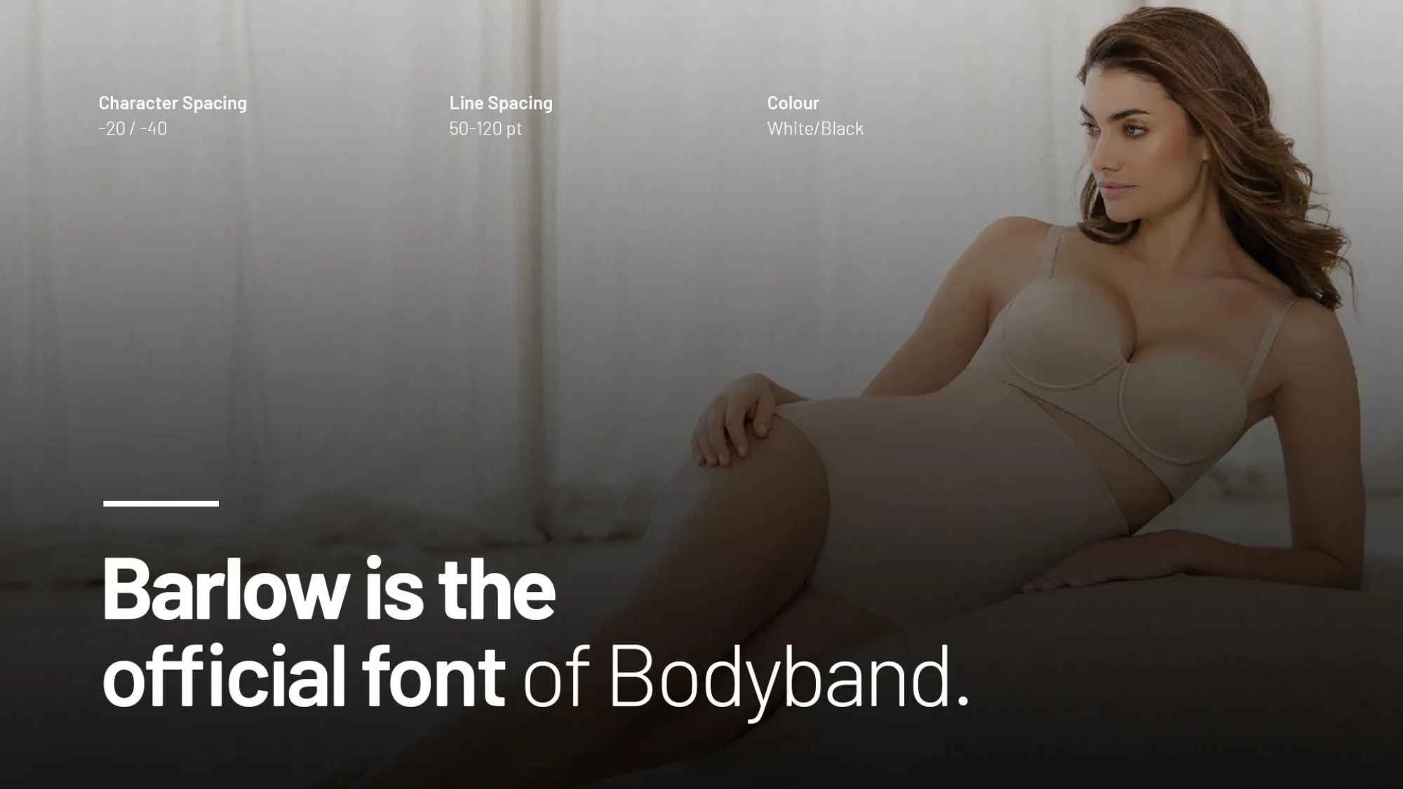
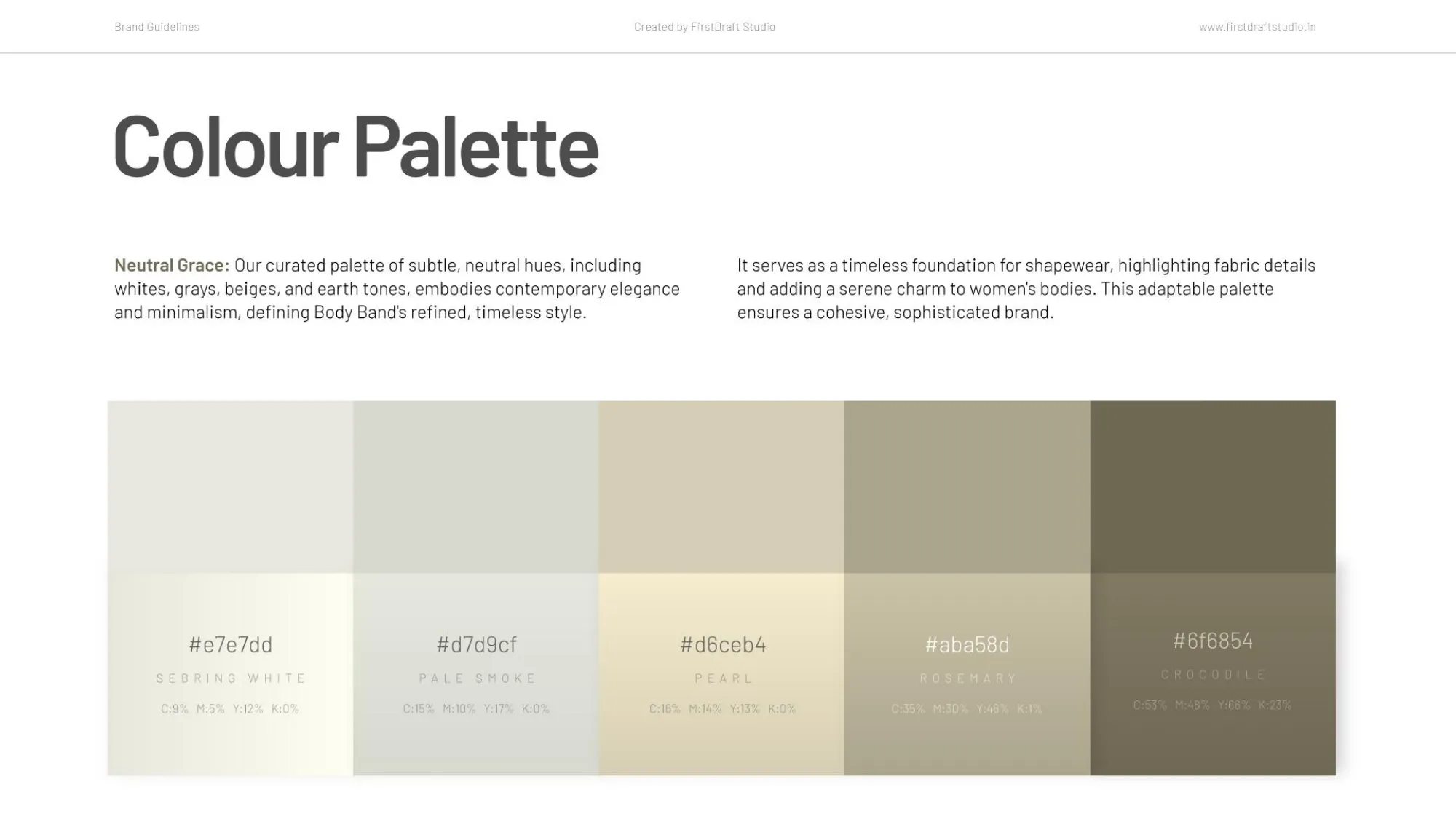
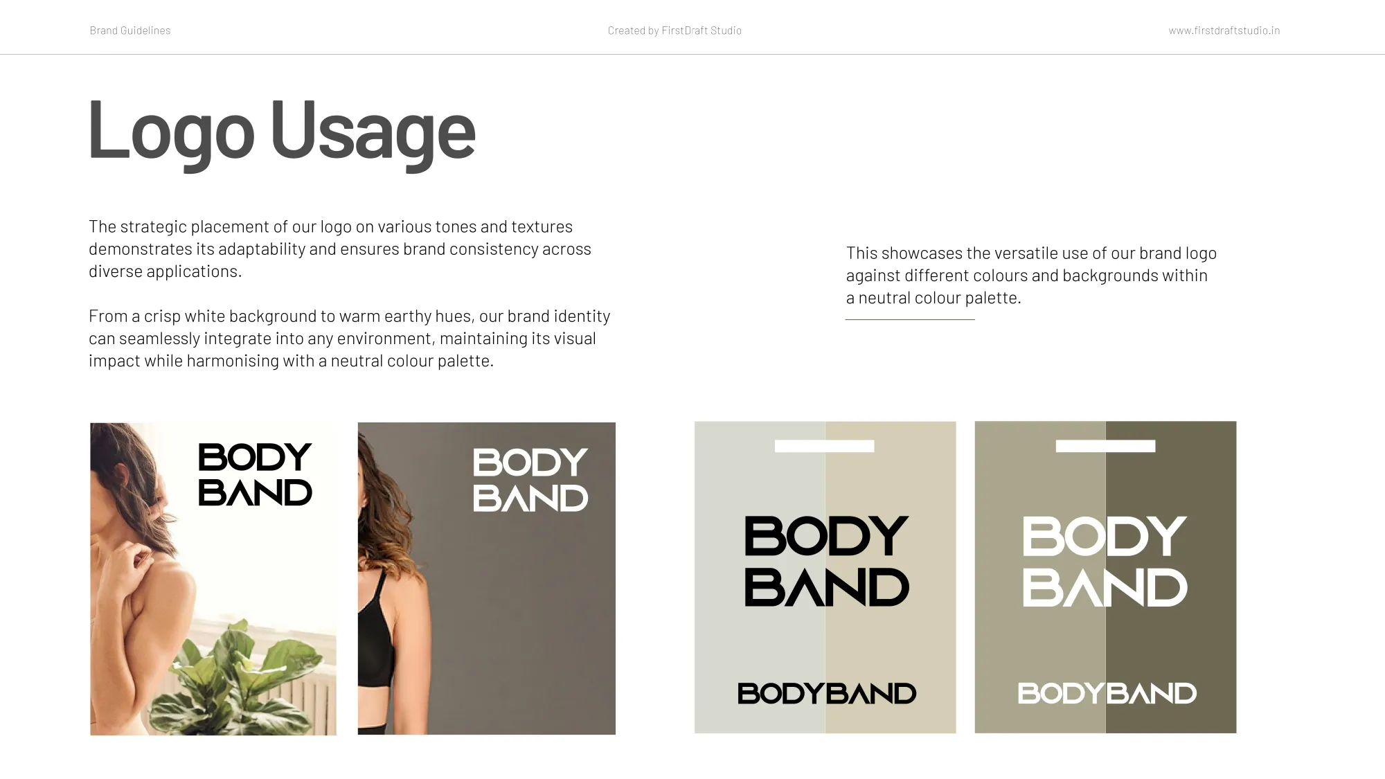
We designed the logo alongside clear usage guidelines, then developed the typographic system and pastel colour palette to create a cohesive visual language.

We connected the verbal and visual identity into a unified system, ensuring the brand could communicate consistently across different contexts and touchpoints.

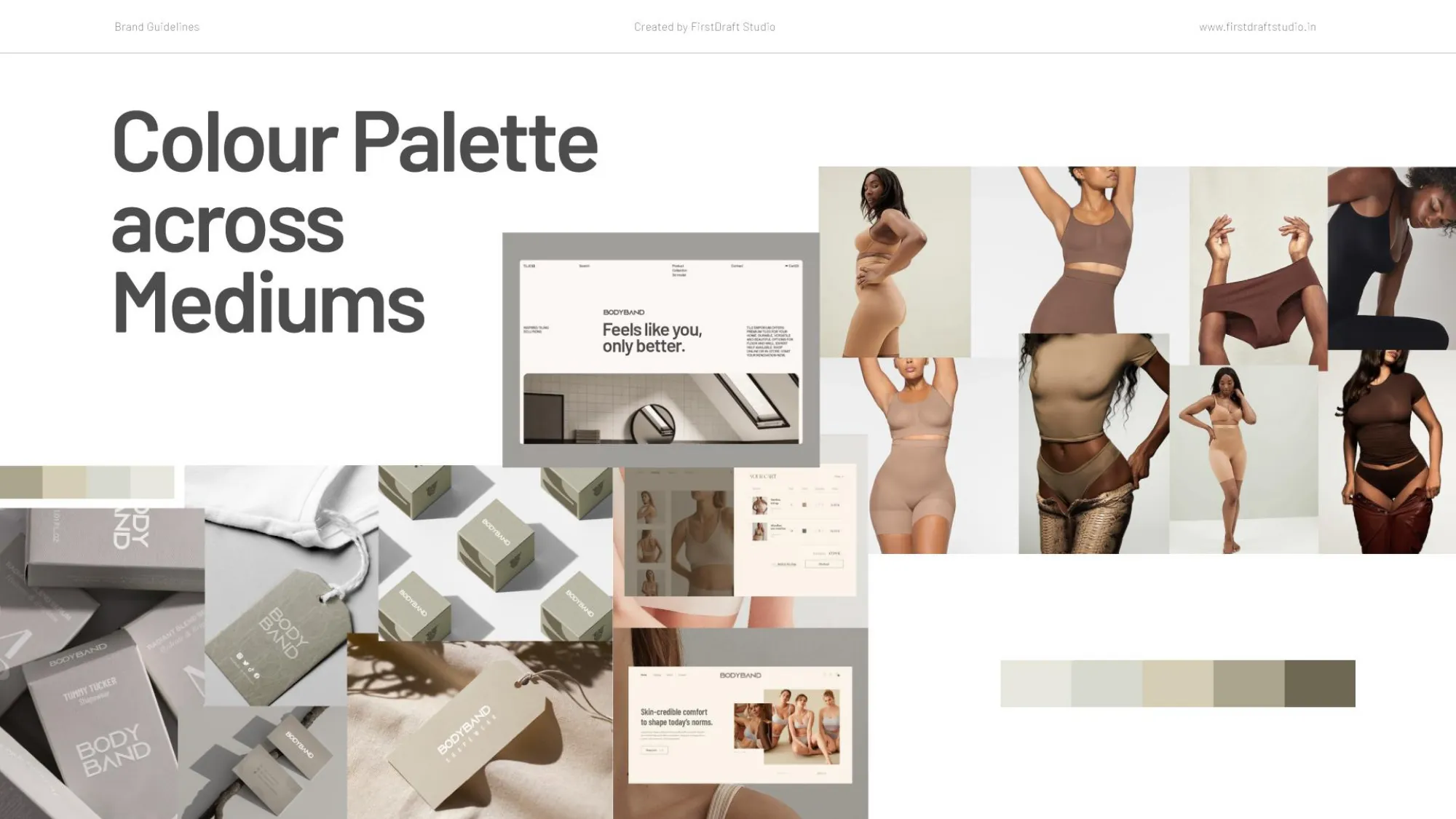
We translated the identity into clear creative direction for packaging, the website, and other brand touchpoints—ensuring it worked beyond the brand deck and in the real world.
01

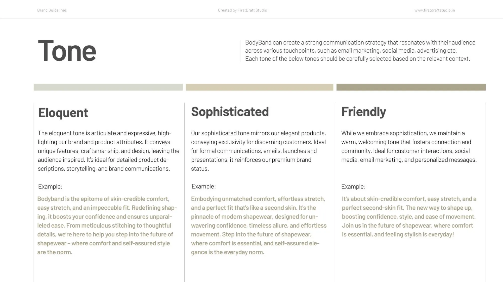
Defined the brand's tone of voice and tagline, ‘Skincredible Comfort.

Every brand decision after this needed an anchor. We built the tone of voice and the tagline ‘Skincredible Comfort’ first, so it could shape everything that followed instead of being bolted on at the end.

03

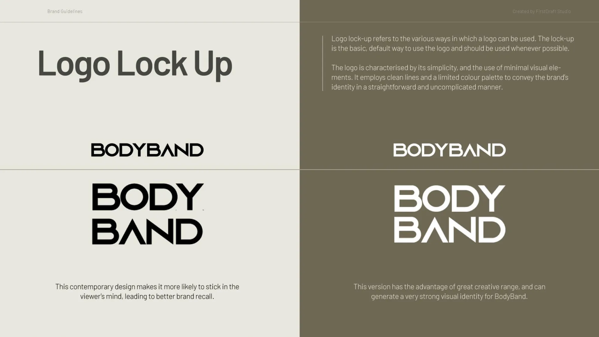
Designed the logo, with clear usage guidelines.

A logo without usage rules gets misapplied within a month. We built the logo alongside documented usage guidelines, so it stayed consistent no matter who was placing it.

02

Built out messaging, brand pillars, and target audience definition.

A tagline needs a framework behind it. We defined the core brand pillars, messaging, and target audience, giving BodyBand language it could use consistently across every channel.

What we did

05

Defined the brand's tone of voice and tagline, ‘Skincredible Comfort.

An identity that only exists in a brand deck isn't finished. We gave direction for packaging and website application, so the brand could show up the same way everywhere a customer might meet it.

04

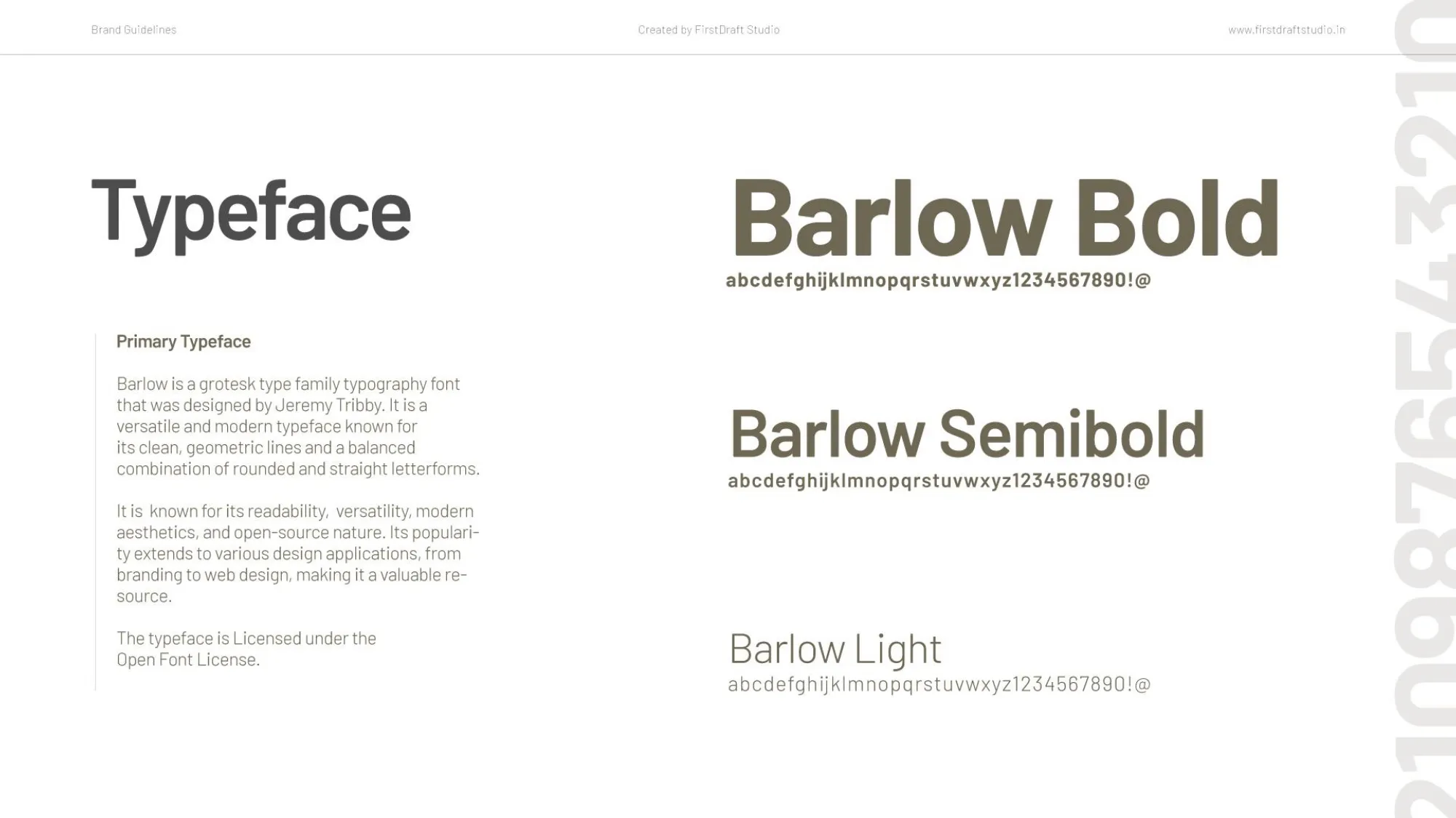
Built the typography system and pastel color palette.

Per the brief, the palette needed to be pastel. We built out the full typography system and a pastel color palette to match, giving the brand a consistent visual voice.

Before & After

Before

After

Brand identity

None, revenue-only Amazon presence

A defined tone, tagline, and full identity system

A defined tone, tagline, and full identity system

Messaging

Undefined

Brand pillars, messaging, and audience clearly documented

Brand pillars, messaging, and audience clearly documented

Logo & typography

None

Logo with usage rules, full typographic system

Logo with usage rules, full typographic system

Color direction

Undefined

A defined pastel palette, per brief

A defined pastel palette, per brief

Cross-medium consistency

Undefined

Direction given for packaging, website, and beyond

Direction given for packaging, website, and beyond

Client perception

"A business"

“A brand” (the client's own words)

“A brand” (the client's own words)

The revenue was already proof the product worked. The identity is what makes people choose it on purpose next time.

The revenue was already proof the product worked. The identity is what makes people choose it on purpose next time.

The revenue was already proof the product worked. The identity is what makes people choose it on purpose next time.

Results

1

Defined Tagline & Tone of Voice

1

Full Identity System

1

Logo + Usage Guidelines

3+

Mediums Directed (Logo, Packaging, Web)

1

Defined Tagline & Tone of Voice

1

Full Identity System

1

Logo + Usage Guidelines

3+

Mediums Directed (Logo, Packaging, Web)

Beyond the numbers

A tagline and tone of voice the team can now use consistently across every channel, not just ads

A logo system with clear usage rules, so consistency doesn't depend on who's applying it

A brand direction that extends into packaging and web, not just a deck that never leaves the brand folder

Image
Image
Image

A tagline and tone of voice the team can now use consistently across every channel, not just ads

A logo system with clear usage rules, so consistency doesn't depend on who's applying it

A brand direction that extends into packaging and web, not just a deck that never leaves the brand folder

Image
Image
Image

A tagline and tone of voice the team can now use consistently across every channel, not just ads

A logo system with clear usage rules, so consistency doesn't depend on who's applying it

A brand direction that extends into packaging and web, not just a deck that never leaves the brand folder

Image
Image
Image

The revenue was already proof the product worked. The identity is what makes people choose it on purpose next time.

The revenue was already proof the product worked. The identity is what makes people choose it on purpose next time.

Takeaways for Brand

Takeaways for Brand

Pin icon image

Revenue Proves the Product

Revenue proves the product. It doesn’t make the brand. That’s separate work, and it doesn’t happen on its own.

Pin icon image

A Tagline Needs a Purpose

A tagline earns its place when it becomes the lens everything else gets built through. Not just a line on a homepage.

Pin icon image

Logo Rules Build Consistency

Logo usage rules matter as much as the logo itself. Consistency depends on both.

Pin icon image

A Brand Must Work Beyond the Deck

A brand identity isn’t finished until it’s translated into packaging and web direction. A brand deck alone convinces no one.

Pin icon image

The Real Sign of a Rebrand

The real signal a rebrand worked isn’t a metric. It’s when the founder stops calling it a business.

Pin icon image

Revenue Proves the Product

Revenue proves the product. It doesn’t make the brand. That’s separate work, and it doesn’t happen on its own.

Pin icon image

Logo Rules Build Consistency

Logo usage rules matter as much as the logo itself. Consistency depends on both.

Pin icon image

The Real Sign of a Rebrand

The real signal a rebrand worked isn’t a metric. It’s when the founder stops calling it a business.

Pin icon image

A Tagline Needs a Purpose

A tagline earns its place when it becomes the lens everything else gets built through. Not just a line on a homepage.

Pin icon image

A Brand Must Work Beyond the Deck

A brand identity isn’t finished until it’s translated into packaging and web direction. A brand deck alone convinces no one.

01

Defined the brand's tone of voice and tagline, ‘Skincredible Comfort.

Every brand decision after this needed an anchor. We built the tone of voice and the tagline ‘Skincredible Comfort’ first, so it could shape everything that followed instead of being bolted on at the end.

02

Built out messaging, brand pillars, and target audience definition.

A tagline needs a framework behind it. We defined the core brand pillars, messaging, and target audience, giving BodyBand language it could use consistently across every channel.

03

Designed the logo, with clear usage guidelines.

A logo without usage rules gets misapplied within a month. We built the logo alongside documented usage guidelines, so it stayed consistent no matter who was placing it.

04

Built the typography system and pastel color palette.

Per the brief, the palette needed to be pastel. We built out the full typography system and a pastel color palette to match, giving the brand a consistent visual voice.

05

Defined the brand's tone of voice and tagline, ‘Skincredible Comfort.

An identity that only exists in a brand deck isn't finished. We gave direction for packaging and website application, so the brand could show up the same way everywhere a customer might meet it.

What we did
Portfolio image
Portfolio image

Ready to look like you're already winning?

Ready to look like you're already winning?

Tell us about your project whether it’s a Website, Branding, or Social Media.

Tell us about your project whether it’s a Website, Branding, or Social Media.

Dubai × Bengaluru

Limited Client Partnerships

Dubai × Bengaluru

Limited Client Partnerships

Available for work

Avatar
Avatar
Avatar
Avatar
Avatar
Avatar

Our team

#Creative Squad